Pages

Friday, 31 August 2018

Harry Potter inspired Gold Foil Wall Art

Happy Friyay!!

I have been using the gorgeous printable gold foil again and this time I decided to make some Harry Potter inspired Wall Art. 

There are no specific Harry Potter cutfiles in the Design Store but there are a lot that can be used/adapted to fit the theme and I have bought several to use.

I needed some simple stand out designs so made a couple myself, and adapted a cut file from the store.

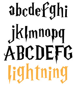
I bought a fabulous alpha LD Lightning 

and I wanted a floating feather and the one is this cutfile was perfect I the birds were deleted)

I used simple shapes (a triangle and circle) to form the symbol for the Deathly Hallows and I made the sign for platform 9 and 3/4 with back this font and a circle. I added some stars and placed everything ready to cut...


I added the gold foil to kraft cardstock


then placed them in frames ready to hang on the wall...


I can't wait to make some more Harry Potter themed items with the Silhouette Cameo and hope to be back to share some with you soon

Happy crafting

Ruth
xxx

Wednesday, 29 August 2018

Design of the Week - Play Ball - 28th August 2018


Hello, Karen here with my Wednesday post featuring this weeks DOTW - Play Ball.
As we all know, The Silhouette Design Store is based in the USA and as such many of the designs cater for that market - this being one of them.  As I don't have anyone who plays baseball and subsequently don't have any baseball themed photos I decided to dispense with the ball and just use the title.  I did wonder if the ball was cut from red it could pass for a cricket ball but I don't have any cricket players in the family either.

So I removed the ball from the design and cut the title from Gold Foil to use on a page telling the story of how my dog, Kiera, likes to hunt around the perimeter of the football pitch, after a game, to find stray balls.  Once they are found she will lay on them with her paws curled around the ball to prevent anyone taking them away. 

I added the word 'nicely' to my title and also used gold foil for the photo mat.


As you can see I used my Silhouette to cut the scalloped white card and the double photo mat, also I cut two scalloped strips too.

I added a few stickers and some felt roses (£1.00 bargain from The Range) and wrote my journaling onto a card with a Silhouette sketch pen. 

So what will you be using this design for - perhaps you have a baseballer in your life or a cricketer?


Monday, 27 August 2018

Art Deco Inspired Gift Card Holder - Gold Foil Sticker Sheets


Hi everyone. It's Verity here from Pretty Little Button bringing you another project. Today's project features the printable gold foil sticker paper. Of course, adding foil elements to any of your crafts always steps your work up a notch, foil adds a touch of class don't you think? I used the gold foil sticker sheets combined with dark grey to create this lovely art deco inspired gift card. The floral design of the gift card isn't really art deco as such, but I think the colours really are!

Art Deco Inspired Gift Card Holder details: 

Load the rose petal gift card design into your design space and resize accordingly. I would resize before you ungroup the objects, to ensure they stay in ratio with one another. To create the gold frame detail, select one of the flap shapes that are separate from the cardholder base. Using the offset panel, select the internal offset. 


This will create an internal offset of the shape, however, in order to get a frame, we need to do a double offset. Selecting only the internal offset you have just created, repeat creating an internal offset using the offset panel. 

You will now have 3 shapes inside one another, gradually getting smaller. In the picture below, the purple is the original shape, which we can move out the way as we no longer need it. Group the two remaining shapes together. 


Repeat this for the remaining flap pieces and for the internal rectangle piece on the design.  Make sure you turn your page size in the page setup window to Letter - this is the size of the gold foil sticker sheets. This way you know where to place the pieces on the mat. To reduce the amount of waste when cutting, use the 'Nesting' feature. Highlight all the shapes and select the nest.


This will align the shapes and next to them close to one another so they will still cut separately but reduced about of waste foil in between.  


If you also included the floral design when nesting, it will nest the floral shape but it doesn't use the waste foil from our framed shapes. 


Instead, just manually move the florals inside one of the frames, as we know we don't need the negative space inside the frames.


When you are ready, load the Gold foil sticker sheet onto your mat and into your machine. Select 'Foil, Printable' in the material drop-down list in the cut window. Make sure you do a test cut first! Don't forget to the cut out the gift card base out of black or dark grey card. 

To assemble, fold over at the score lines. Remove the foil frames from the sticker sheet and adhere to the corresponding flap. Make sure you burnish this down to ensure it sticks well. To adhere the floral shape correctly, remove the negative outline - as we placed this inside a frame, you should a small rectangle you can pull away with the negative of the floral. Very lightly position this on the gift card holder, where you wish to place the floral. 
You can now use the negative outline, to add in the positive shapes, allowing you to assemble the floral whilst maintaining the shape.


Art Deco Inspired Gift Card Holder Photos:


If this has inspired you to try this out, please post below. I would love to see it!

Until next time,

Verity


Profile Pretty Little Button Blog | Instagram | Facebook

DESIGNS USED:

Rose petal card invitation set by Jamie Cripps, Design ID #49502


PRODUCTS USED:


Sunday, 26 August 2018

Sunday's with Steph - Big title 12 x 12 Scrapbooking Layout


Hello - Steph here on todays blog post!

Today I have created a 12 x 12 scrapbooking layout with a title from the Silhouette Store.  The title I used was https://www.silhouettedesignstore.com/view-shape/262333 which is actually for a t-shirt so I had to make it a little smaller to fit my layout.


I cut out the title using my favourite bazzill basics textured diamond white card and then I painted it using Prima's metallic water colour paint.  Once dried I used foam risers all the way round the title to make it really stand out on the top right hand corner of my page.


I used various collections to make up this page all fairly recent papers from Crate Paper, Cocoa Vanilla Studios and Amy Tangerine carboard embellishments.  The friendship bracelet was something I made myself with a cardboard loom (if you would like to make one yourself there are plenty of instruction videos to be found to be found via google) I pushed two brads into the papers and formed a washing line between the two holes which I slotted the embellishments onto after punching holes in them with a cropodile.


I thought the layout was complete but I found some cute pink lettering that balanced the layout a bit better and I felt (as normal) that the layout NEEDED sequins so I picked a pinch of iridescent hearts up with the intention of putting them about the page but decided I liked them where they were so spread them out a bit better and stuck them down and that was it page completed!


Thanks for reading and I'll be back next week!

Take care and happy scrapping

Steph x x


Saturday, 25 August 2018

Wriggle Hiss Hiss | A Layout just for Fun by Niki Rowland


Hey guys, Niki here today. Do you know just how great the Silhouette Design Store is??? Whenever I need a design to document a particular event or memory in my life, I can guarantee that the Silhouette Design Store will have it! Literally any quote, animal, shape - ANYTHING!

This is what's just soooo great about owning a Silhouette machine - the Design Store is so vast and has so many 1000s of designs and I'm so grateful for the diversity of the designs available.


For this layout I needed a snake. I typed 'snake' into the search box in the Design Store and it came up with loads of options. I picked one and cut the design from patterned paper - such an easy and quick process!


The snake was obviously the focal point on my layout and I also added lots of bits and pieces of ephemera and other embellishments from the Boys Rule collection by Cocoa Vanilla Studio. I added my title using Thickers stickers. 

 I love the way the layout turned out and I love even more that if I want a snake shape for my layout I can have one instantly using my fabulous Silhouette Machine and a design from the Design Store - so awesome!

Thanks for joining me today and happy scrapping xx

DESIGNS USED

PRODUCTS USED:


Friday, 24 August 2018

Secret Message Birthday Card using Printable Glow in the Dark Sticker Paper


Hello, hello - Karen here with a special little card I made for my daughter's partner.

I have used this method previously - for a secret message frame here .


To start drew a 5 inch square and wrote 'Happy Birthday'.  Write it again twice more below using a smaller size font, group the two lines of text together and replicate them below four times.  Finally change the out line and fill colour of each line.


Print this out onto a piece of white card and cut to 5 ins square.

Next design your glowing in the dark message.  I wrote Josh's name and added some stars.


I used this design for the stars and resized it to 5 ins tall.  Bring your text to the front of the design.


Select the text and the stars and 'Subtract All' - this will merge the text and shape.


Your design should look like this.


You now have to lay the same text as you printed onto white card onto the text and stars. (I have changed the outline of the text and stars to black so it is visible - don't do this on yours as it will print black onto your sticker paper.  


Print this onto a piece of Printable Glow in the Dark Sticker paper and then cut.  Once cut you simply have to carefully remove the printed pieces and align them to the text on the printed piece of card. I found that this was much easier than I had anticipated. 

You should now have a card that looks quite simple in daylight but has a hidden surprise once it gets dark.


DESIGN USED:


PRODUCTS USED: