Pages

Saturday, 29 September 2018

Sunday's with Steph - First Adventures with HTV - Mamasurux Rex &Twinasaurux Rex


Hello and welcome to this weeks blog!

So I have been putting off using the scary stuff HTV but it's was my sisters baby shower and I just HAD to make her a t-shirt.  Her nick name is Torasaurus or Tora Rex due to a family joke as we all have long arms and hers are shorter than ours so she's just like a tyrannosaurus rex with their short little arms hence the nick name!

So I started off with this design: https://www.silhouettedesignstore.com/view-shape/272987 which gave me the initial idea of what I wanted to do.  I then started to play around with it as I had decided to do baby vests too so I needed to change the lettering.

I ungrouped the design and moved the dinosaurs off of the page then I highlighted the small dino and copied and pasted it an additional three times, two dino's for my sisters t-shirt and one each for the baby vests.

I then typed the wording that I wanted using: CG Good Times Font and remembering to mirror the lettering first I sent it to cut.  After that I removed all of the lettering and dragged the large dinosaur and the four little dino's on to the designing area ensuring that they are close enough so to keep the waste to a minimum.


Once cut I weeded away the bits that I no longer needed and placed them on the vests and the t-shirts.  I used a hot iron to make the HTV stick to the fabric and hey presto here is the finished result!  I was really chuffed with them, they are not perfect by any means but they are my first attempt and my sister thought that they were great!


After my first no problem HTV look out for future HTV projects....I'm sure my next one will be Worlds Greatest Aunt or something like that!!

Until next time,

Steph x x

Happy Autumn with flocked HTV pumpkins!

Tthe Summer has really gone, but I am thankful for the sunshine and beautiful colours we are having so far this Autumn. It makes me think of falling leaves, sweater weather, apples and of course pumpkins.

So when we were given flocked orange HTV to play with I knew it was going to become a pumpkin...

I chose the  Jolly Jack cutfile,it wasn't too wicked or scary so suited an Autumn theme and not just Halloween 


As a bonus it was featured in the Silhouette Store's 'weekly steal' a couple of weeks ago...do check them out as ''With Daily Deals and Weekly Steals, there are new discounts every day. Daily Deals are changed every 24 hours and are marked down 30% (40% on Fridays) while Weekly Steals are reset every Tuesday and are half-price.''

This was my first time using HTV, I wasn't sure how easy it would be and I hate ironing! But it was a really simple process, cutting the image in a size to suit the plain t-shirt I was adhering it to, using the silhouette preset guidelines.


I added a smaller pumpkin and the outer 'offcut' from another to form a group of 3 


I also made 2 tiny treat bags


which I stuffed with Halloween sweets


making for a seasonal show of perfect pumpkins...


I have several Halloween projects planned for my next few posts and also look forward to seeing what my teamies make with some of the amazing products we are showcasing in the run up to October 31st.

I look forward to seeing you all soon

Ruth xxx

ps Silhouette is celebrating a birthday and giving us all 50% off until Ocotber 1st...I have bought everything on my wish list and I am adding more to my basket!


Wednesday, 26 September 2018

Design of the Week - Making Magic Happen - 25th September 2018


Well hello lovely Silhouetters - it's that time again - DOTW.  This week it is a cut file - Making Magic Happen. 
I have to admit I was at a bit of a loss as to what to do with this one as I didn't want to use it on a scrapbook page and that is my 'go to' project.  I took the dog for a walk whilst I had a think and saw a friend who's daughter had married at the weekend and that's when inspiration hit me (you never know when it will)!  What an ideal sentiment for a wedding or anniversary card and so my project for this week was born.

I used a 5.5 square card and matted a 5 x 5in piece of gold glitter onto that.  I then cut a piece of white card 4.5 ins square and used an embossing folder to give it some texture. 


I reduced the design to 4ins wide and cut it from the same gold glitter card.  I then rearranged the layout of the design and used the centre of one of the stars for the dot on my 'i' in 'making' and one of the larger stars as the dot on my 'i' in 'Magic'. 


From not having a clue as to what I was going to do to making a card I am really pleased with all because I took Kiera out for a walk - how fortunate was that?


Tuesday, 25 September 2018

Still Hungry | Niki Rowland | Print and Cut ANYTHING


Hey there, Niki here today with a tutorial on how to Print ad Cut ANYTHING! I think the Print and Cut feature is brilliant and it means that I can print anything and also cut it out perfectly very easily. So here's a quick tutorial on how to do that.

I wanted The Hungry Catapillar embellishments for this layout. I looked in the Design Store and there wasnt anything - I wasn't really expecting there to be any. So I went on to Google and downloaded a few images that were of reasonable resolution. I opened them up in Silhouette Studio.


I started with the fruit. I clicked on the 'trace' icon (butterfly) and dragged a box over the fruit. I made sure they were all yellow by adjusting the Threshold slider and as soon as they were completely yellow, I clicked Trace.

This gave me red cut lines around the very outside of the fruits. I wanted to remove the circles from the middle of each piece so I selected the fruit and Released the Compound Path. I then deleted the inner circles.

Now I need to create an offset - this is an outline around the edge of the exisiting cut lines. The reason for this is that I want my cut lines to leave a small white border around the fruit, rather than cut exactly on the edge. I selected the fruit and went to the 'offset' icon (star). I clicked 'offset' and narrowed the size using the 'distance' arrows and then clicked 'apply.

I now have a lovely offset around my pieces of fruit but the inner cut lines still remain, so I simply deleted them.

I could then movet he fruit image back onto the screen and now each piece sits perfectly within those cut lines.

OK, on to the catapillar. The same steps apply - I traced him using the Trace icon and I had to fiddle with the Threshold icon to get him to mostly go yellow. All those hairs were a bit tricky but eventually I was happy with how yellow he was. His eyes were not completely filled in but I could deal with that later.

You can see below that lots of the hairs have individual cut lines, and his eyes have cut lines too. I selected the whole lot and went to the Offset menu. I selected the Catapillar and clicked 'offset'. I narrowed the distace a little but too much and the offset would try to go around each of the indivdual cut lines of the hairs, rather than around the  catapillar as a whole - the bigger the offset, the less detail the offset will pick up on. Experiment with this next time you use the Offset tool.

Once happy with my offset I clicked 'apply'. I then moved the offset cut line off screen and deleted all of the original cut lines - including the eyes and all the hairs. I then moved the offset back onto screen and moved the catapillar images back within the offset.

Here they are ready to be cut.

So to actually print and cut them, I chaged my page size to A4 (as my printer is A4) and I turned on the Registration marks.

The Registration marks are the most important part here as those are what the Cameo reads in order to match up the cut lines with the printing.

I resized and duplicated my images and cut lines onto the A4 size, and then when happy, I went to File, Print and printed this sheet via my home printer. It prints with the Registration marks too. I could then put the printed sheet onto my cutting mat and send it to cut. The cameo then reads the Registration marks and perfectly cuts out the printed images. 

Cute embellishments hey!


I could then make my layout using the Print and Cuts as embellishments. I added other embellishments too of course.


Thanks so much for joining me today, I hope you've found that useful and that you will have a go at using Print and Cut! Happy scrapping xx 


Monday, 24 September 2018

Halloween Wall Decor


Hi everyone. It's Verity here from Pretty Little Button bringing you another project. Today's project features the glow in the dark vinyl.  I used this vinyl to create a fun Halloween decoration to hang on the wall, either inside, or by our front door. So even in the dark people will still see your message, perfect for halloween!

Halloween Wall Decor details: 

To start, draw a panel representing your canvas, and make sure you adjust the paper size in the page set up to represent the width of the vinyl - this vinyl is 9" wide. 

 Next, insert the design into the design space and position over the panel representing the canvas. Centre this within the panel using the transform window below. This will allow you to see if you can make the design and bigger or if it needs to be smaller. 


This design is very thin, and maybe difficult to cut and weed. To get around this, add a small 0.05 offset to the letters and delete the inner design as you don't want this to cut later as well.  


In the send panel, make sure you select the glow in the dark vinyl in your material and test cut to make sure the settings work well for your machine and blade.


Once cut, weed the negative so only the design is left on your baking sheet. Cover with a piece of transfer tape and burnish until the design is transferred onto the transfer tape. Position over a painted canvas and burnish the design down onto the canvas. Remove the transfer tape to finish. 

Halloween Wall Decor photos:


If this has inspired you to try this out, please post below. I would love to see it!

Until next time,

Verity


Profile Pretty Little Button Blog | Instagram | Facebook

DESIGNS USED:

Sketch have a hugntingly happy Halloween phase by Kristen MageeDesign ID #48797

PRODUCTS USED:


Sunday, 23 September 2018

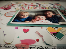
Sunday's with Steph - The best seat in the house - 12x12 scrapbooking layout


Hello all and welcome to this weeks blog!

So I had a lovely photo of three of my little cousins sitting at my nan's house all in her chair - it was almost begging to be scrapped.

I used a sheet of bazzill diamond white textured card and cut out this butterfly design:https://www.silhouettedesignstore.com/designs?search=paige+taylor+evans+butterflies&sortby=relevance&submitted_search=true  I trimmed it down to 11 inches and used a script paper and created a boarder.


I had a packet of texture stickers from creative devotion which were great!  They added great splashes of colour to my layout and the layout quickly took shape!

My photo was placed onto a piece of green card and I added a black and white branch design piece vertically behind the photo and a solid black piece of card which I had added a scalloped edge too on the right hand side.


Next came the title that I added backwards so it would be in the right position when I finished.  I also in gold glitter font added the word perfect as I know I am bias but I truly think these three are!! Once I had finished the two titles I added lots of chipboard stickers and loads of coordinating enamel dots! My two final pieces were the rosette and of course no layout would be complete without some journaling!


I hope you have enjoyed this weeks design.


See you next week!

Steph xx