Pages

Thursday, 28 February 2019

How to create whiteboard labels for your home office with your Silhouette

I love this make this week. When I opened my design team pack I was super excited to see the whiteboard vinyl as I knew I had a great little product for it, so this week I will be doing a really simple project on how to create these great whiteboard labels for your home office.

Materials Needed
The first thing that I did was to open the file in Silhouette Studio. I chose quite a simple but classic design as it fitted in with the look of our office. I also wanted something with a lot of room to write on. I placed the shape that I wanted at the top left of the page and then duplicated the shape. To duplicate, with your shape selected go to the right hand menu and select the replicate panel and duplicate the shape until you have the number you need.  


Once you have the shape duplicated open the 'Send' tab to cut the labels out of the vinyl. I used the 'Vinyl, whiteboard' setting. It cut out really well. 

Whiteboard vinyl labels cut out

Placing the whiteboard vinyl labels 

Labelling boxes

I really love this project as I am always reorganising everything and its great to be able to relabel boxes every time I change things round. Thanks for reading the blog post :) Leave me a comment if you liked it. You can also find me over at my website at Helens Craft Studio


Wednesday, 27 February 2019

Design of the Week - 26th January 2019 - Fresh Start Font


Hello, hello and happy Wednesday to you - hope you are enjoying the unseasonable sunshine that we are lucky enough to be experiencing.

Today's Design of the Week is a font - Fresh Start.

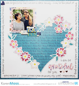
I really liked this font and decided to pair it with a Page Evans cut file that was released yesterday - Flower Heart. 
As anyone who is a regular reader of my blog posts knows, I like to mix things up a bit and so decided to use the font with a sketch pen rather than cut it out - this meant that I was able to easily journal around the edge of my page.


Also, I didn't want the heart design detached from my page - I only wanted the centre cut from my white 12 x 12 card.

  • Reduce the size of the heart to 10ins wide and add to the page, slightly off centre.

  • Release the compound path (this ungroups all of the parts of the design).


  • Select the outside line of the design and changed it's colour to blue (I am going to use a sketch pen on this line rather than a blade).


  • Select all of the elements in the design and group together.
  • Draw an 11 inch square and centre on the page.
  • Select the font Fresh Start.

  • Type the first word of your journaling. You will see a green box around your word with a cross inside a circle.  Drag the circle to the top left of your 11 inch square - you will now be able to journal around the square.  I changed my font size to 30. 


  • You are now ready to cut the red lines and sketch the blue ones. 


Once cut/sketched I  backfilled my flowers, added my photo and a few chipboard embellishments.


PRODUCTS USED:

Monday, 25 February 2019

Faux leather paper dimensional die cuts


Hello, it's Verity here from Pretty Little Button. I hope you've had a busy weekend with your machine and finding plenty of inspiration over here on the blog to help you on your way. I have a trio of cards today where I used the Faux Leather paper from Silhouette to create dimensional and striking die cuts.  The paper comes in three beautiful colours - brown, white and black. Now I am using it in a more non-traditional way I was wanted to create dimensional intricate die cuts for some cards. I didn't wet the paper to create that leather look. Instead, I was focused on make thing the most out of the strength of the paper.

As the paper is strong I thought it would be perfect of cutting thick and intricate die cuts without worry it could rip when peeling off the paper, or having to cut it with many passes or fraying like it can do with thick cardstock. Whatsmore, this paper is thick, it has some weight to it and I used blade 6 to cut it. That means if I want dimensional die cuts I've got it with this. No die cutting the dame shape 3-4 times, the layering over one another and adhering with liquid glue. Which to be honest is very fiddly! So remember to have a look through your different media and think what non-traditional ways I can use this? How can I get more out of my supplies?

Faux leather paper dimensional die cuts process: 

To start, I want to show a little tip for those that may not be aware of it. When you look up a design in the store, you are greeted with the window below. As I wanted the designs to pair well, I needed to see if I could find any other designs that are similar to this. The best and easiest way to do that is to check out the designer of that design and it is so simple to do!


In the window pop-up, click the link below the title of the design - This is the designer and will be coloured with the Silhouette blue showing it is a link. You will then be redirected to the designers 'page' in silhouette where you can view all the other designs/cut files by that designer. It is a great 'filter' where trying to find similar designs.

Once I had located all my designs and download them, I added them all to my design space. Now I just kept adding each one, and they were just landing on top of one another - although it looks a hot mess, it makes the next step so much quicker than if I had done this each time I had added one to my design space. 


I drew my cursor around all the designs to highlight them all in one go. Then to make it easier to 'plan' my cards out in the design space, I turned the fill and line colour to black. As I waited until I had added all of the design into my design space and selected them all together, this sped to the process up ten times!


But, once you have changed the colours all together, don't let go of that group just yet, you can also quickly resize them in one go to. Make sure you hold 'ctrl' down whilst your resize them using the cursor and grabbing one of the four corners. Doing this with 'ctrl' held down resizes the shapes evenly without distorting the shape.


 To help plan my cards, I drew two rectangles to represent my card bases and used the width and height boxes to adjusts the rectangles to my desired sizes. 


 Lastly, I could position the designs roughly how I would want them on the cards to see if I needed to resize any of the designs so they were in proportion to the card base.


When I was happy with the designs, I adhere a small cut of the paper onto my mat, making sure this corresponded to where I had placed the design on the studio mat to cut out. My cut settings for the faux leather paper were blade 6, speed 5, depth 33 and 2 passes. But remember, do a test cut first, every machine and blade will differ when it comes to the cut settings!

TITLE photos:

To put the cards together, I created 3 watercolour backgrounds using some hot press smooth watercolour cardstock. I used the36 pan set by Altenew and add a wash of water to each watercolour card panel. 


With the wash in place, I started to add in small hints of colour allow the colour to blend out and soften. For this card, I used Persian blue, Industrial Diamond and desert night. The panel was dried before I added paint splatters of Jet black  to added interest.


To adhere to the die cuts I used Gina K Connect glue and added a heat embossed white and black sentiment from Altenew Sketchy Floral stamp set. 

For this next card, I added strips of green colour across the card from Evergreen to Forest Glades, Frayed Leaf, Bamboo and lastly Citrus Burst. Instead of using black splatters, I used to paint splatters of Evergreen. 


I finished the card with a simple stamped 'hello' from Altenew Ink Flora stamp set. 


For this last card, I used soft yellows and oranges: Fresh Lemon, Warm Sunshine, Orange Cream and Autumn Blaze.  For the paint splatters, I used Autumn Blaze. the soft colours of the background pair well the with white faux leather paper. 


Again, this was finished with an embossed white and black sentiment from the Sketchy Floral stamp set from Altenew.


If this has inspired you to try this out, please post below. I would love to see it! And let me know what you think of the Faux leather paper, have you used it? What did you create with it?

Until next time,

Verity


Profile Pretty Little Button Blog | Instagram | Facebook

DESIGNS USED:

Leaves by Wild Pilot, Deisgn ID#282488
Magnolia flowers by Tanya Batrak, Deisgn ID#197470
Floral flourish by Skyla Design, Deisgn ID#275947
Floral flourish by Skyla Design, Design ID#275531
Branch leaves by Skyla Design, Design ID#275948
Branch leaves by Skyla Design, Design ID# 275949
Flower bud flourish by Skyla Design, Design ID# 275950
leaves by Skyla Design, Design ID#275951
Leaves by Wild Pilot, Design ID#282487


PRODUCTS USED:
    

Sunday, 24 February 2019

Sunday's with Steph - 12 x 12 Large single initial layout


Hello Crafters!

Welcome to this weeks blog post :)

So this week I have created a layout using my Times New Roman font that is freely available font.  I typed the letter "K" onto my design mat and then enlarged it from 72. to 1000. so it took up most of the page and then sent it to cut on my machine.


I backed the letter with a yellow printed piece of paper and then flicked the paper with gold, navy and plum paint spatters.


It took me a while to decide where to put the photo on the layout.  I felt that you needed to see all four corners of the initial or it didn't look right.  Once I had decided where to place my photo I then started to add the embellishments.  I had added an embellishment cluster to the bottom left of the photo and along the top of the photo along with a acrylic perspective.  Lastly I added some bunting to the top left corner of the layout to complete it.


I hope you have enjoyed this weeks blog post.

Until next time, happy scrapping!

Steph xx

Saturday, 23 February 2019

Faux Letterboard Card


Hello, Janet here from the Crafting Quine blog. Today I have a faux letterboard card for you. I've been inspired by all the letterboard dies around at present, and it struck me that the Silhouette Adhesive Corrugated Paper would be perfect to give a similar effect with minimum effort. The letters have been cut on the Silhouette too, with single and double height letters and some extra script and icon embellishments. There is so much versatility for all kinds of cards with this design, so I do hope you'll try it out.

Selecting the Design
The base of the card is one of the 3D Frame Cards by Lori Whitlock. I used design ID #101975 which has a Christmas theme, but any of the similar designs will work. To find them all search for '3D Frame Card' in the Silhouette Design Store and filter by Artist, selecting 'Lori Whitlock'. Most of them appear at the top of the page. Select one that has a panel on the front of the frame if you want to add a wood patterned panel as I have done.


Preparing the Frame Card Base
Ungroup all the file parts, and discard all but the base card, the frame, the frame panel, and the interior panel. I increased the size of these remaining pieces so that the 3D frame piece would just fit onto a piece of 12" x 12" textured cardstock. This gave a finished card of 17cm x 13.25cm, which made it easier to cut and place the letters. However, it did make the accompanying box piece bigger than 12" x 12" so be aware that if you make it this big you'll need A3 cardstock and the larger sized cutting mat to make a box to fit. The interior panel was cut from the Silhouette Corrugated Paper, which gives the letter board effect. It is self-adhesive and easiest to apply to the card frame while it is flat, before folding it up.


Preparing the Lettering
Choosing the correct font is critical for the letterboard effect. I cut the basic black letters in a sans serif font that was pre-installed on my computer from black cardstock (this one is similar to Ariel). Just avoid a font with a circular 'O', as a font with an oval shaped 'O' (and other rounded letters) generally fits in the limited space better. I cut two of each letter and layered them together. The larger letters are LW Trendy font with the background shape cut from white cardstock and the cutout layer cut from Silhouette Textured Translucent Vinyl, giving a glitter plastic-y finish to those letters. The word 'Birthday' was made from LD Charming Bold font. I recommend choosing a favourite script font that maintains a similar width through the letters (that doesn't get too narrow). However, if your chosen font is too narrow, use a small offset to thicken it up.


For the little precent icon, I chose the letter 'a' from the LW Birthday Dingbats font. I removed some of the detail, by releasing the compound path and deleting all but the outside line and the bow loops, grouping it all together again (if you want it to display correctly on the screen make it into a compound path again, it will cut correctly either way). Cut the present from the same materials as the 'GREAT DAY' words, layering the vinyl on top of two copies cut from white cardstock.


Finishing the Lettering
If you have a problem getting your letters to align (as I always do), use this little alignment trick I have for you. Arrange the letters on your mat on a rectangle of the same size as the frame interior, add the cut line shown in blue (below), and cut the whole thing from a piece of scrap card.


Use the scrap piece to align the first row of larger letters.


Then use strips cut horizontally across the centres of the other words to align each row in turn.


Once all the letters are adhered I add liquid glaze to the black letters to give them a more plastic-y appearance. The translucent vinyl would be great for this too.


Making the Box
The cut file for the box is included with the design. If you increase the size of the card as much as I did you'll find that the box is too big to fit onto 12" square cardstock. In which case use A3 card and the larger sized cutting mat. This box was cut from a background pattern (design id #171187) printed onto A3 cardstock. By aligning the pattern and the design to the centre of the card I was able to print THEN cut, so a Print & Cut was not necessary.


The box is the perfect finishing touch. I can't wait to give this card to its recipient!


Bye for now,

  Crafting Quine Blog@CraftingQuine


DESIGNS USED:
 3D Frame Card by Lori Whitlock  Blue Wood Grain Pattern by Lori Whitlock Handpainted Watercolor Stripes Background By Angie Makes  LW Trendy Font by Lori Whitlock  LD Charming Bold font by Scrap N Fonts  LW Birthday Dingbats font by Lori Whitlock


PRODUCTS USED:
 Silhouette Adhesive Corrugated Paper  Silhouette Textured Translucent Vinyl  Silhouette Cameo 3  Silhouette Cameo Large Cutting Mat  Silhouette Studio designer edition