Hi. My name is Hilary, and I am passionate about getting more of you to use the excellent software provided with your Silhouette Cameo to make your own designs. Do you fancy that?
You might think your skills with the Silhouette Cameo software aren't good enough, or perhaps you simply don't know where to start? I probably spend even more time designing files than I do actually making things. Apart from the glorious satisfaction of designing something of your own, you have complete copyright on anything you want to do with that shape from there on, and as we all know there are masses of ways to use a Silhouette file.
The skills you need to follow this tutorial, and what I will assume you know, are a basic knowledge of the icons around the Silhouette design desktop. You need to be able to trace, replicate, fill with colour and rotate shapes by 45 and 90 degrees. You will also need to know how to select shapes and align them as you want. It is only by trying things out that you learn what the software (and you) are capable of.
Like me, since you got your Cameo you may be much more aware of patterns, colours and designs all around you. These often swirl around my mind as I fall asleep, and I always keep a planner nearby to jot down ideas. In April 2016, there was a free Design Of The Week (DOTW) which consisted of rows of triangles. At first glance it may not have inspired you. Horror of horrors, you may not even have bothered to download it, but I am going to show you where it lead me!
The triangles made me think of Native American woven blankets, so I Googled that, and had a look at some of the patterns. This triangle pattern particularly caught my eye.
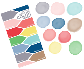
At this moment in the design process I have no idea what I am going to eventually create, but my imagination has been caught. Next, I have to decide what colour palette to use. There are many great sites that will show you inspirational combinations of colours e.g. Pinterest, and Design-seeds.com. Each year, the company Pantone, publishes a colour palette for the fashion world. Pantone is a system for matching colours, in particular, printing ink colours. Below, you can see their colour palette for 2016, and beside it are some splotches of colour I drew on my iPad using a drawing app. I adore using my iPad for designs, in tandem with using my Silhouette. If you are interested in using a tablet with various graphic art apps, let me know by commenting below, and I will write a project/tutorial about that at a later date.

The green and the yellow were not ticking any boxes for me, but the Peach Echo, Limpet shell and Serenity were very appealing. As the free file was just a jpeg, in order to split the pieces part for manipulation, you need to trace the triangles in the Silhouette software. Once you delete the original picture, that then gives you rows of triangles that you can fill with colours, using the colour picker (eye dropper) and the Pantone scheme. The humble triangle is a really good shape, and as you can see below, I was soon making diamonds and star shapes which had endless possibilities, but I kept coming back to the image of the blanket design. I tried a few colour combinations, and as you can see each gives a very different effect. I like the one with the dark blue background, but the one with the white background was definitely my favourite!
I made three outer frames. For the dotty square border I selected a group of the horizontal dots and replicated them four times. Two of these dotty lines are then rotated 90 degrees and moved into place to make a square. For the solid line I simply drew a square, then selected a line colour and a line thickness that I liked. For the inner frame I used the outer frame, copied and pasted it, and made it smaller for the middle. If you want the same size of dots, it is simply a matter of ungrouping the dots and making a smaller inner square.
I replicated the triangle border for the four sides, and rotated two of them by 90 degrees, and moved them into place. This left me with rather white corner areas. After another enjoyable play with the triangles I had made a corner design element. It is easiest to do this in the same zero degree position as when you are making the border, then once all the elements are in position, select them all, group them and rotate them 45 degrees for the first corner, and so on for the others. If wanted, you can also make a central element, as shown in the finished design at the top of this page.
So there you have it. I started with a very simple triangle, but after many fun hours of mucking around, I have a lovely frame which I will be using for planner stickers, tags and cards as those are my main areas of interest. Obviously if you want a rectangle frame, you simply need to lengthen two of the opposite sides before grouping everything. If you want to print and cut the rectangle, enable registration marks, check that only the outside of the square is set to cut, or you might want to cut both the inner square and the outer square.
Please have a go at designing for yourself. I can thoroughly recommend it! Maybe you would like to start with a square, a circle, a star or a hexagon, or pick a simple animal shape, like a rabbit, a butterfly or a bird. Please let me see what you come up with. Your feedback in the comments section is so important to us all, otherwise we think we are "talking" to ourselves, and it can be a tad worrying!
Hilary
PRODUCTS USED:
 |  |  |


Lovely! Who knew you could do so much with the humble triangle? Thank you for a fabulous and inspiring tutorial Hilary. I love the Pantone colours too,
ReplyDeleteOh Pantone colours - brings back memories of working as a tableware designer. Love what you have done and love that I am learning so much from you all.
ReplyDeleteA tableware designer? Karen you have hidden depths we didn't know about. That sounds like amazing fun! I should have said that Pantone colours are not just for fashion, but used right across the design industry. As I tend to always veer towards blues, it is a great way to make myself try new combinations.
ReplyDeleteGreat tutorial, thank you for sharing it
ReplyDeleteThank you DJG. I hope it will inspire you!
ReplyDelete