Hello, Nadine here again with another Silhouette Basics tutorial, this time on the align tool. Silhouette Studio allows you to align shapes in various ways, making your inner perfectionist very happy!
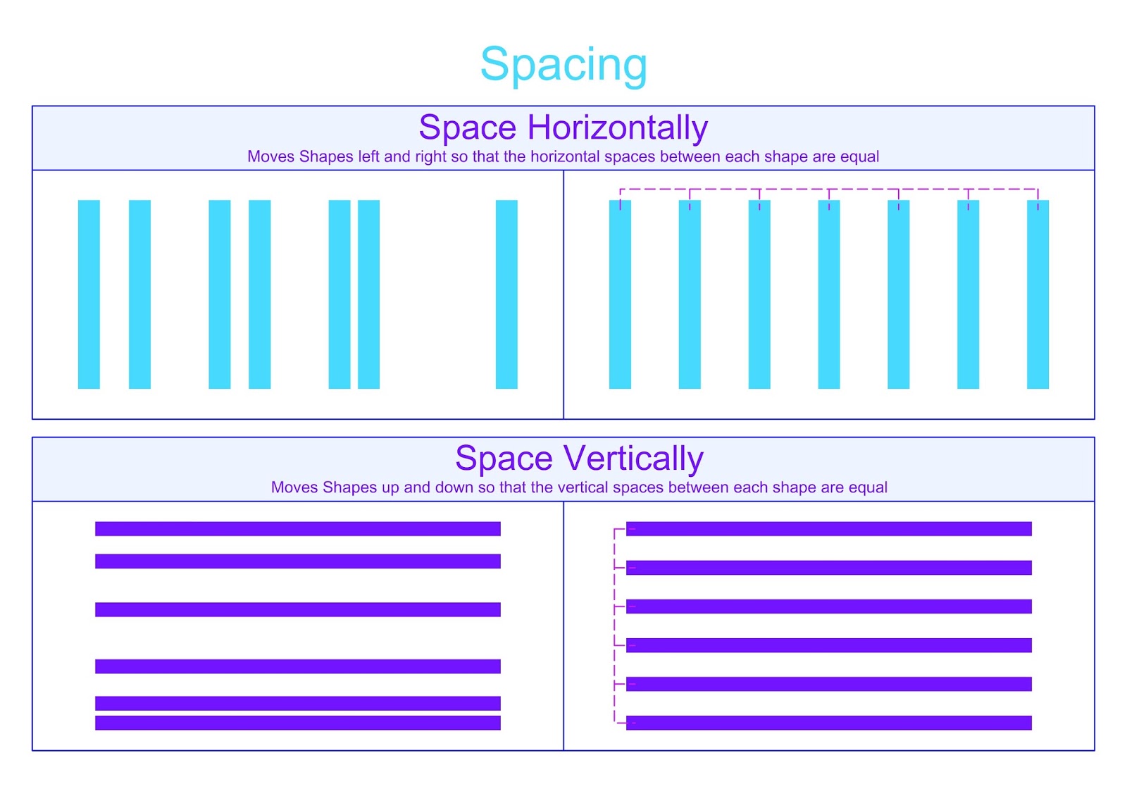
I've made a little cheat sheet to help illustrate what the various options do. If you'd like to print this out, you can download a PDF here. For the seasoned pros reading, I have also included some hints and tips for usign the align tools in an advanced way, such quick tricks for aligning side-by-side and also specific distances apart.
The Align Tool Window
The Align Tools icon has three bars with a little line through their middle:How the Align Options Work
On the subject of perfectionists, you'll notice that the software uses the American spelling of centre. As much as it pains me, I have used this spelling in the cheat sheet headings as I'm referring to the official tool name. The descriptions use the regular English spellings.How to Space Multiple Spaces Evenly
Centre to Page
The last button on this menu is the Center To Page option. This centres your selected shapes to the centre of your page, as chosen in your Design Page Settings menu. This option is wonderful when doing print and cuts, especially double sided print and cuts, which I'll be covering in my next tutorial.Ninja Tips
Here are a few tips for people who are as obsessed as I am with making things neatly aligned, covering more complex situations.Ninja Tip 1: Convert text to path to align perfectly
When aligning text, it is better to convert to path instead of keeping as an editable text with green box. This is because the green box allows for various spacing rules within the font and might not be the exact rectangle around your shape. I find this happens more for jaunty fonts than simple ones.Notice how the example on the left overlaps the pink margins, whereas it fits exactly within them once the text has been converted to a path?
Ninja Tip 2: Use a Line to Help Align to Complex Positions
You might need to align two shapes in a complex way that is not available in the menu options. I have a little trick: use a temporary line to help you make the alignment. Here's an animated screenshot showing you how I used a line to align the top of one circle to the bottom of another. I also used this trick to align the top of a rectangle to the middle of a doily circle.
Top tip
I'm addicted to shortcut keys, so instead of using a line, I often use the shortcut of cntl + arrow key to duplicate my shape exactly left, right, above or below my original. This shape can be used in the same way as the line shown in the screenshot above.
Ninja tip 3: Use a spacer rectangle to align shapes an exact distance apart.
Lets say you need your shapes to be exactly 10 cm apart. If you know your shapes are 3cm and 4 cm long, you can make a rectangle which is the total length (3+4+10 = 17cm) and align the first shape to the top and second shape to the bottom and the gap will be exactly 10cm.Alternatively, if your shapes are odd sizes, you can make your spacer shape 10cm and use my tip #2 to align the spacer exactly touching. Here I've used the duplicated shape method instead of a line - I used the replicate window as it's easy to follow my steps, but in practice I use the shortcut keys.
Ninja tip 4: Align Without Moving your Main Shape
When you centre two shapes, unless one shape lies within the other, both shapes will move. Often this is undesirable. In my example below, I have a circle nicely aligned in cenre of a card template. I want to centre the letter A into the middle of the circle,so I do a little alignment dance:Note that I can drag the A into the circle and then click centre, but I often have both shapes already selected.
I hope that this tutorial has something useful both beginners and experienced Silhouette Studio users. If you have any other top tips for aligning, I'd love to hear - just pop a comment below.


No comments:
Post a Comment