Tuesday, 28 February 2017

How Many Rolls of Washi Tape Does a Girl Need? (Using some of my many, many rolls of Washi)


Hello, hello, Karen here with a quick idea on how to use up a little of the miles and miles of Washi tape that I own.  I am such a sucker for the stuff and buy loads of rolls and then they just sit in my stash with just an inch or two being used from each roll.

I wanted to at least give the pretense that I have tried to use some (but may have to buy another roll or two to make up for the amount I have used on this project)!

You will need:-

  • Rolls of Washi tape
  • A piece of card (I used 12 x 12 as I wanted to make a layout but you could use smaller for a card)
  • A piece of 12 x 12 black card
  • A piece of 12 x 12 white card
  • Bronze Silhouette sketch pen
  • Silhouette CAMEO®

Step One - Making your Washie sheet.

  • To make my Washie sheet I simply pulled out one of my bags of Washie tape and randomly dipped in and pulled one out.  I then run a length along the top of my piece of card.
  • I continued in this way, unless the pattern on the tape clashed or was too similar to the one before, until I had covered all of my piece of 12 x 12 card. 

STEP 3 - Cutting your background.
  • I chose this cutting file for my background and made the design 11.5 ins square. 

  • I set my cutting depth to 3 and also turned on the double cut option. Once cut I mounted it onto a piece of black card.  I tried it on white first but to be honest it looked awful and I thought I would have to abandon this project but the black saved the day. 

STEP 3 - Completing your layout.
  • This page came together quite quickly once I had decided that I wanted to emphasise the star pattern with a quote about stars.  I found the perfect quote and title and remembered I had the perfect photo of my daughter blowing a 'dandelion clock'  
  • I then decided that I wanted a photo mat as the background was so busy any photograph would get lost on it. 

  • As the background was quite heavily patterned I wanted the title and quote to be quite delicate and so decided to use a sketch pen instead of the blade to create them.  I changed the dot on the i to a star.
  • Before drawing my elements I added an offset to them so I could cut around the pieces once I had written/drawn them.
  • The final step was to add my elements and photograph and as an extra touch of sparkle I added one of the cut out stars to the 'Wish' title. 
I have saved the cut out stars to use another time as they are too pretty to throw away.


And a few close ups of the project. 


DESIGNS USED:


PRODUCTS USED:

Sunday, 26 February 2017

Beautiful Chaos...so many Hearts!


Hey Silhouette fans, Niki here with you today with lots of hearts - 288 to be exact :) 

Call me crazy but I have a bit of an obsession with foam pads, and giving my layouts lots of dimension, and therefore if it is possible to sick it on a foam pad, then chances are, it will be on a foam pad! This time however, I have surpassed even myself.

I had a gorgeous piece of Hazelwood paper by 1Canoe2 and throught I'd cut out all these little hearts on my Silhouette. I then peeled the 12x12 sheet off the cutting mat leaving all the litte hearts behind. I layered my paper over a piece of  white card and stuck it in place with some removable tape. I then painstakingly, put each heart back in place, using the 12x12 sheet as a template, but raised each one on a foam pad. Once all 288 were in place, I was able to carefully peel the template off and I was left with a background full of gorgeously pretty hearts, all popping off the page.

The result is a super fun layout, full of dimension!


It did take a while, but not as long as stitching, so that's good enough for me!
Until next time, happy scrapping xx 


Designs Used:

PRODUCTS USED:


Saturday, 25 February 2017

Nadine's Farewell and Showcase of Readers' Makes

A round up of Nadine Muir's favourite projects for Silhouette UK showcasing readers' makes from following the tutorials
Hi gang, Nadine here and today is my last post as part of the Silhouette UK Design Team *wipes dewy-eyes*.  What better to bid a fond farewell than a nostalgic round up of my very favourite projects that I've shared over the past twelve months?

I love the wonderful community of Silhouette users we have here in the UK and it's great to learn from each other and share hints, tips and inspirations.  As such I'm especially proud to share with you some of the lovely makes that fellow crafters have made by following some of my tutorials.

How to Design Typography Papercuts and Songbird Bunting Project

Back in May I did a two part tutorial on papercuts - the first was a guide to different methods for designing papercuts with wording and the second one was a step-by-step tutorial for the bunting style papercut that I did for my friend Emily's wedding present.

A two part tutorial on typography papercuts.  First one is a guide to various methods and the second is a step by step tutorial to make bunting style papercuts.  Tutorials by Nadine uir for SIlhouette UK Blog

Readers' Makes 

Check out the gorgeous acrylic heart decorated with vinyl cut crazy fine. Danielle from Designs By Danielle made this for her friend's wedding.

Vinyl decorated acrylic heart made by Designs By Danielle following Nadine Muir's papercut tutorial from Silhouette UK Blog
Courtesy of Danielle Shearer from Designs By Danielle

Crafter Stitch Font

I don't think I would have attempted to make my own font before I started on the Silhouette Design Team and I'm very glad it has challenged me to be experimental and adventurous.  Plus I got to use some of my lovely fabric stash.

The tutorials here are No Sew Fabric Applique with HTV Edging, the Crafter Stitch Embroidery Font and No Sew Appliqué with HTV Embroidery Stitching

Tutorial for No Sew Applique and HTV using Free Crafter Stitch Embroidery Dingbat Font from Silhouette UK Blog by Nadine Muir

Readers' Makes


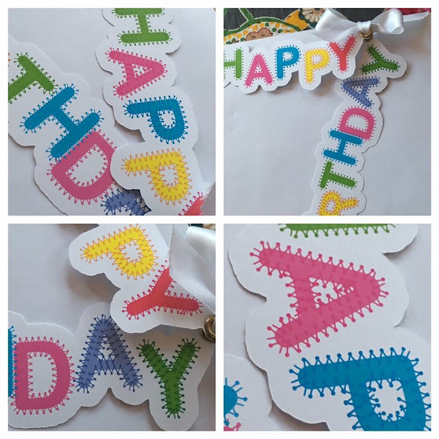
I originally designed the Crafter Stitch Font for use with HTV, but have used it for other purposes, including the heart frame for the bunting papercut above.  Debora Regent used the font to make these these fab oversized print and cut tags.
Oversized print and cut gift tags made by Debora Regent using Nadine Muir's Crafter Stitch Font for Silhouette UK Blog
Courtesy of Debora Regent via Silhouette UK's Facebook Page

Salt water and Edinburgh Etch

I learnt to salt water etch on a jewellery making course in France and my teacher Karen kindly agreed to for me to share her expertise with you lovely people, she also introduced me to Etching dichroic glass.  I followed up the Salt water etching tutorial with one on an alternative etchant using Ferric Chloride called Edinburgh Etch.  I used the same Edinburgh Etch recipe to etch a stainless steel hipflask for my dad, so focussed that tutorial on general hints and tips for all types of etching.  I finished my series with a tutorial on how to etch sterling silver.

Salt water and ferric chloride Etching tutorials using vinyl resists cut with the Silhouette.  Tutorials by Nadine Muir Silhouette UK Blog

Readers' Makes

Margaret Read from Sleepy Thistle etched these copper cuffs using the Edinburgh Etch recipe, aren't they totally divine?!

Copper etched cuffs by Margaret Read from Sleepy Thistle made using Nadine Muir's Edinburgh Etch tutorial on Silhouette UK Blog
Courtesy of Margaret from Sleepy Thistle

Lesley Graffham salt water etched her music mad daughter a copper guitar pick for her 18th birthday and Dawn Martindale used salt water etching on brass discs to fabulous effect.
Salt water etched copper guitar pick by Lesley Graffham and Brass discs by Dawn Martindale.  Both made using Nadine Muir's etching tutorial for Silhouette UK Blog
Salt water etched copper guitar pick courtesy of Lesley Graffham and brass discs courtesy of Dawn Martindale

Adios and Not Goodbye

This past year has been a blast. I hope you have enjoyed these tutorials as much as I have enjoyed making and sharing them. I would be very excited to hear if you have also made something by following one of my tutorials.  Comment below or better still show us pictures - Facebook is probably easiest the Silhouette UK page is here and my personal blog Facebook page is Craft Chatterbox.

I hope to pop back for the odd guest post and in the meantime you can find me over at www.craftchatterbox.com.  I have a page which lists all my Silhouette UK tutorials and I also have a new blog post up today all about bows which includes a free Silhouette compatible cut file.

Nadine x


Friday, 24 February 2017

Cutting Thicker Cardstock with Cameo 3


Hello,  Janet here again.

Today I have a 3D model-making project with some tips for cutting thicker cardstock on the Silhouette CAMEO® 3. For this project I used 240gsm A3 Black card. I have found that black, and some other dark colours of card, can be trickier to cut, and need higher settings than lighter colours.  Here I'll show how I cut the black card pieces for this Big Ben Lantern by Jennifer Rush.


WHAT YOU'LL NEED

Silhouette Vellum (for the windows)
Vinyl - Matte Removable and Clear Transfer Tape (for the clock face)
Black Heavy-weight Card (A3 or 12 in. x 12 in.)
Painter's Tape (Washi or Micropore Tape works too)
Liquid Card Adhesive
Double-sided Adhesive Tape
Flameless LED Candle
Downloaded Big Ben Lantern File by Jennifer Rush (#135986)


STEP 1: PREPARE THE FILE

Open the file in the Silhouette Studio® software. Change the Design Page Settings to match your paper size (12in. x 12in. or A3) and mat size (Cameo 12in. x 12in. or Cameo 12in. x 24in.). Adjust the size of the complete file as necessary (select all elements, hold down Shift and drag one of the white squares [sizing handles] until you have the size you want). I made the whole file a little bigger so that the tower pieces were as big as they could be and still fit on a piece of A3 card.


Move the auxiliary pieces (non card pieces) off the mat and arrange the card elements. I offset the large pieces from each other a little too.


STEP 2:  PREPARE TO CUT

Mount the card firmly onto the cutting mat. Use the larger 24-Inch by 12-Inch Cutting Mat if you are cutting from A3 card. Add some painter's tape at each corner of the card to ensure that it won't shift. In addition, remember to pull the drawer out at the front and extend the extra support pieces to keep the mat as flat as possible (I often forget it is there). Ensure that there is room to the front and back of the machine for the larger mat to move freely.


STEP 3:  ADJUST CUT SETTINGS

Carry out a Test Cut and adjust your settings accordingly. Try and use as low a blade setting as you can, thickness being less important. In fact, consider cutting thicker, or any new media, as a 3 step process:
  • Test Cut
  • First Cut (through the top layer)
  • Final Cut (to the final required depth)
It is taking me a little while to get used to the AutoBlade that comes with the Silhouette CAMEO® 3, and I find that the default settings are sometimes too high for my media. I found this to be the case when I used the default Coverstock settings (Blade 5, Speed 1, Thickness 31) and the Test Cut function.  This was apparent because the blade left cut marks on the mat and shifted the triangle away from the mat surface.

TIP: There are excellent instructions on how to ascertain the initial blade depth for any type of cuttable media for the original Silhouette black or blue blades from Brian at GraphtecGB in his post here.  To understand how the blades work read Nadine's post here.

After a little trial and error I found the ideal initial setting for my card was Blade 2, Speed 2, Thickness 22. It then required a second pass at Blade 2, Speed 2, Thickness 27, without removing the mat between cuts.  I would expect the cut settings for the ratchet blade to be higher, and closer to the default settings.

TIP: Your settings may vary considerably from mine as there are so many variables (blade age and sharpness, stickiness of cutting mat, thickness as well as density of the card etc.) However, the principle that I'm recommending with thick and difficult cardstock is that the first cut should be deep enough to at least cut through the top surface without shifting the card.  Then the subsequent pass (possibly with a higher thickness setting) deep enough to complete the cut,  following path of the preceding one. 

I've also found that is a good idea to click on the media (i.e. Coverstock) to open the Editing dialogue section to check that the AutoBlade is actually selected, as the Ratchet Blade is currently the software's default.


Cut your pieces and remove them from the mat.


STEP 4:  CUTTING THE AUXILIARY PIECES

Cut the auxiliary pieces; vellum for the windows, and vinyl for the clock faces. After using the test cut function I reduced both settings from their defaults.
  
Tip: Vinyl is a great medium for cutting small details and being self adhesive means there is no danger of excess glue messing up the vellum windows).


STEP 5:  PREPARING THE AUXILIARY PIECES

Remove the excess vinyl from around the clock faces then transfer the faces to the vellum squares using clear transfer tape.


STEP 6:  ASSEMBLING THE MODEL

The file designer Jennifer Rush has provided a full set of assembly instructions for the model. The instructions are accessible from the design's details in the Silhouette Design Store and the link is also available in the Show Properties information from the file's icon in your download library. I have written more about accessing this information in a recent post (Preview Files in Silhouette Studio®).

Attach the vellum pieces with double-sided tape.


Pre-fold the card pieces prior to adhering them together with liquid card adhesive.


STEP 7: FINISHING TOUCHES

Once the model is assembled place an LED candle inside the model to illuminate it from within.

Unfortunately, my LED candles were either too wide or too short for the model and so I rigged up this little cheat. It is a short LED candle (votive size) balanced on an old spice jar. Not quite tall enough, but not far off.


Here is the finished model lit from within.


I hope this has given you some help with cutting thicker card successfully with your Silhouette CAMEO® 3.

Bye for now,

   Profile | My Blog | Pinterest | Twitter | Instagram


DESIGNS USED:


PRODUCTS USED:
 Clear Transfer Paper  Vellum