Hello, Janet here with a new step-by-step tutorial on designing your own shadow word die cuts in the Silhouette Studio® software. Large metal word dies with a matching shadow, or halo, seem to be everywhere at the moment, and I'm so pleased that we can make infinite variations of these using our Silhouette machines. I've made a small selection of diecuts in different colours using the
Silhouette Adhesive Cardstock and the software's Print & Cut feature. The same technique can also be used to cut the pieces from regular coloured cardstock too, but the adhesive backing makes them clean as well as fast to use.
Silhouette Adhesive Cardstock
There are 8 sheets in a pack, each sheet being 8.5in. x 11in., or 215 mm x 280 mm. The sheets are essentially smooth, coated, medium-weight cardstock with an adhesive backing, protected by a yellow peel off layer. They can be printed on using a home printer. I used my regular inkjet printer and the colour reproduction was bright and clear.
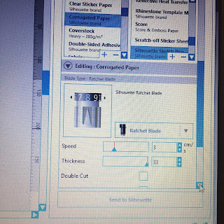
Silhouette® Studio software recommends a setting for the adhesive cardstock sheets under "Cardstock Printable, Adhesive-Backed" (Blade 4, Speed 3, Force 29 and a single pass). I found that this setting cut a little too deep, so I reduced the force to 24 to achieve a 'kiss cut'. Of course, your ideal setting may differ, so I'd advise that you carry out a test cut first.
Designing the Shadow Diecuts
Step 1: Choosing a Font. You can choose almost any font to make a shadow diecut. I've seen the metal dies in all capitals, all lower case and title case, serif fonts (with the extra horizontal bits), non-serif, monoline (letters are a regular width) and script, or brush fonts. I've chosen the
Watermelon Font from the Silhouette Design Store, which is a premium script font. It is a fancy font (with extra glyphs), which you might think would be too intricut to cut successfully with thick card, but I have a couple of work-arounds for you, so read on!
Step 2: Generate your Words. Click on the Text Button and then type the words that you want to use.
Place each word on a new line, but keep them in the same text box (for now). Then, EITHER (1), Select the text, navigate to the Font section of the library, find your chosen font and double click on it, or (2) Select the text, navigate to the Text Style panel, chose the font and click once. As I have a lot of fonts, I find the former method is quicker (shown in the pics below).
Step 3: Finesse Your Words. Adjust the Character Spacing if the majority of your letters are either too close or too far away (if there are only a few that need moving, adjust them separately after ungrouping). Select all the words and ungroup (select, right mouse click, Ungroup).
Note: you can no longer edit your text once you have done this, so if you are uncertain, or may want to edit the text later, make a duplicate copy before ungrouping, and keep it off the the side. Once your letters are all ungrouped they look like this.
Fine tune the placement of individual letters if necessary. The only change I made was to move the dots on the 'i's a little closer down.
Step 4: Thicken the Font. Thicken your letters by using an offset of the words if, like me, you've used a script type font with fine details. It is usually unnecessary to thicken other styles of font. To thicken the font, select one, several, or all of your words, then open the Offset panel, zoom in, click offset and enter a small value. It is better to do this rather than reduce the value with the slider because the necessary offset is so small that is is easy to inadvertently take the slider to zero. If that happens you'll need to start the offset again. For this font I typed in a Distance of .01", Square corners, and then clicked Apply. Prior to clicking Apply the offset looks way too large, but it does reduce in size when you click apply.

If you are happy with the result, move or delete the original letters (a quick method is to move the new one aside (one word piece), delete the original (many letter pieces) and move the new one back into place). WARNING: Don't delete your dots by mistake (been there), and also keep some of the original letter insides (counters); I sometimes substitute the new ones with the originals if the new ones are too small to cut. Fill the new words with colour, they will automatically have welded, but you might want to group each word, so that you can easily rearrange them on the mat if you need to without leaving bits behind (select a whole word, right mouse click, click Group).
Step 5: Make the Shadow (or halo). Select all the words again, open the Offset panel and this time make a bigger offset. In this case the default of 0.125", Rounded Corners worked for me, but you may want a bigger offset.
Note: Your offset distances will be different if your font size is different. I have kept mine to the default size throughout. Examine your new shadow offsets. If you have little gaps like these, you'll need to delete them. To do that, select the offset, right mouse click, select Release Compound Path, then delete the small pieces. I think its best to do this word by word.
Step 6: (Optional) Add an Overlay. I chose to overlay a duplicate of the word in a different colour a small distance away from the original, giving a more 3D look. To do this just select, right mouse click, and Duplicate. Move it around and send it behind or in front of the original until you like the effect (select, right mouse click, Sent Forward, or Send Backward). Group the two copies of the word together, turn line colour to clear, and move them apart from the shadow piece.
Step 7: Print & Cut. Turn on the Registration Marks in the Page Setup panel, Registration Mark tab, and tick the Show Print Border and Show Cut Border in Page Setup tab. Ensure that Print Page Setup is set to US Letter Size, and that Borderless, or Print to Edge is NOT selected. Arrange the words, shadows, and any extra bits within the the print and cut area, avoiding the hashed areas. Add a printing gutter around each shape if you wish, but you'll need to use a different line colour and then Cut by Line so you don't cut the gutters. Print the sheet and then send it to cut on a mat through your Silhouette. You'll need to use the Simple tab, and Cut Edge if you have made overlays, but ensure that each word and its overlay are grouped to each other. If you have used both gutters and overlays you'll need to use both Simple and Cut by Line cuts in succession with different line colours. Cut settings are suggested above.

Step 8: Finishing. Once cut, layer the words onto the shadows, and they are ready to use on your projects. One of my favourite ways to use them is to cut the shadows from vellum - try different materials and see which looks you like best.
Example Project
I used one of my shadow diecuts with the pieces from the
A2 Happy Watercolor Card by Carina Gardner to make a quick Print & Cut window card.
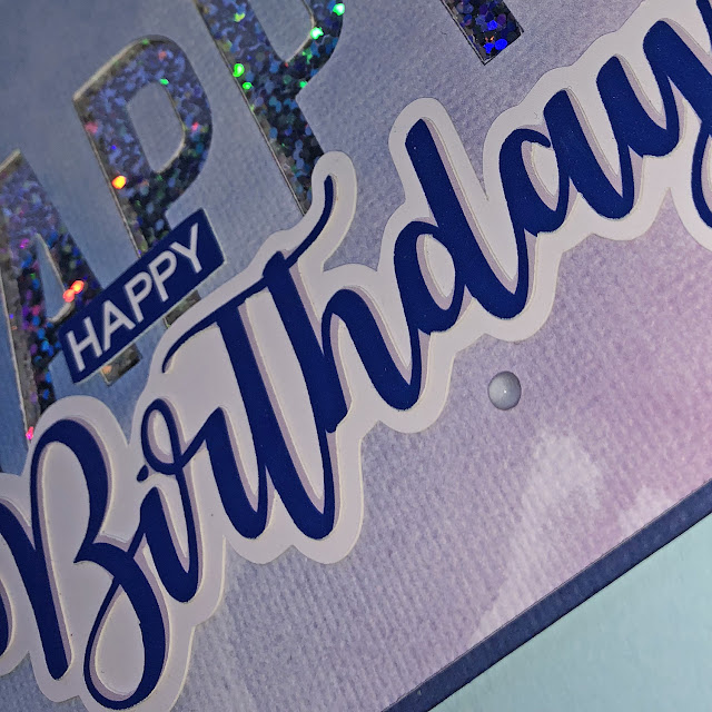
This is the resulting card - quick and easy thanks to my pre-made diecuts.
Do comment below if you've found this tutorial useful.
Bye for now,
DESIGNS USED:
PRODUCTS USED:


