Sunday, 30 April 2017

Stitched Offset - Fun Times Layout


Hiya, Niki here with you today making a layout with a stitched outline. I love to include hand stitching onto my layouts but it takes ages so I don't do it as often as I'd like, but I was pleasently surprised that this didn't take too long at all.

I started off by selecting a design, these 'Doodle Fames Set' and ungrouped and deleted the two frames I didnt want.

I then re-sized so the heart frame filled my cutting mat.

I then created an outline using the Offset menu. I also created an outline for 'Fun times' too.

I positioned my outlines onto my cutting mat where I wanted them to cut. I've got the original files stored over to the right.

I then selected the outlines and went to cut settings, where I selected 'perforate' and then sent to Silhouette. I did this on white cardstock and the perforated file provided me with a stitching template. I then cut my original files on patterned paper, this means that they sit perfectly within the stitching template perforations. I then stuck the patterned paper files within the perforated edges on my white cardstock, the set off stitching.

I stitched around the outline, in between all the little scallops and inside the heart, as well as around 'Fun Times' and then built my layout ontop of that pretty stitched background.


 I love this technique becuase it allows me to combine pretty paper together with delicate hand stitching and the result is a great combo.

Happy scrapping xx 


Designs used:
Doodle Frames Set

PRODUCTS USED:


Saturday, 29 April 2017

Using Studio for Desktop Publishing


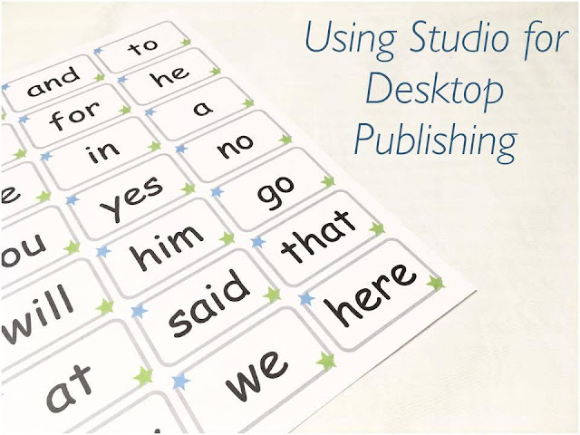
Hello everyone! Marie-Clare here with a simple design project using Silhouette Studio as a simple desktop publishing tool. Did you know that this free software is as powerful as some bought packages? It's great!

My little boy is starting to recognise letters, so I wanted to make him some sight word cards.

These can be cut using your Silhouette Cameo or Portrait using Print and Cut, but they can also be designed in Studio and cut with a paper trimmer.

You will need:


  • Silhouette Studio

Step One


Open a new document and use the Design Page Settings button to set up your page size. I am using a standard A4 page. You can deselect the "Show Cut Border" check box because you are not going to be cutting this sheet. (At this stage, if you are cutting your cards with your Silhouette machine, set up registration marks)


Step Two


Use the shape tools on the left hand side of the drawing space to draw a rectangle for your card. I then used the rounded rectangle tool to add a border inside this.

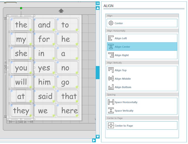
Select both of these shapes and open the Align tool (top right toolbar), then click "Align Center" and "Align Middle".


Step 3


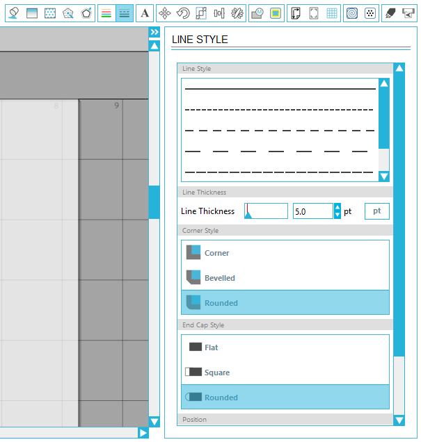
Use the line colour and line style buttons on the top right hand toolbar to change the colour of the rounded rectangle and adjust the weight of the line. I went for a grey colour and a 6pt line.


Step 4


Add some embellishments if you wish. I used the polygon tool (left hand toolbar) to draw a very simple star, then copied and pasted it into two corners. I used the fill tool to change their colours.


Step 5


Use the text tool (top right toolbar) to select a font, and write your first sight word. Resize it to fit inside your card shape.

I used the system font Comic Sans because it uses similar letter shapes and forms to early readers and writers.

Now, select the designed part of your card (rounded rectangle and two stars) and right click to group them together.


Step 6


Now comes the clever part. Select your entire card, and go to the top right toolbar. Find the Replicate tool (it looks like a little flower!)


Scroll down until you see the "Row of three" and "Column of four" option. You can select "Fill Page", but I find I can squeeze more in just by doing it myself.

Click "Row of three".


Then, with all three shapes selected, click "Column of four" and repeat until your page is filled.


Step 7


Because you didn't group the text to the design, simply double click each "the" and replace it with a different sight word for each card.


Then, select the entire first column and use the Align tools to align "center". Repeat for the second and third columns.


Step 8


Send your file to print, and use a paper trimmer or scissors to chop up your new simple sight word cards!


Friday, 28 April 2017

Add a Stand to Almost Any Design to Make Home Decor Items - with a FREE Stand File


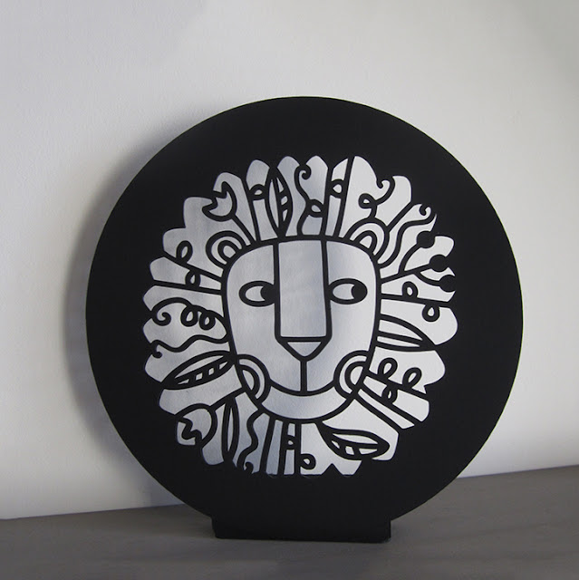
Lion Head Cutout and FREE stand Cutting file by Janet Packer for Silhuette UK Blog


Hello,
Janet here with a tutorial on adding a stand to a design, enabling a flat design or even a card to be transformed into a piece of home décor.  This involves welding the stand shape onto an existing design. In this post I show you how add this shape and have included a FREE file of the stand shape for you too.


Lion Head Cutout and FREE stand Cutting file by Janet Packer for Silhuette UK Blog


I've used this glorious lion head paper-cut design by Nic Squirrell. There are two versions in the store a card, and a box; I used the card version.


The original card file is placed in a square, but I wanted it to sit within a circle. To do that I simply released the compound path and regrouped the lion head elements (omitting the square). Then I centred the design within a circle and then grouped them.  For this lion head decor piece I also made a duplicate piece with the head placed at the centre a larger circle, just big enough to hide most of the stand.


Lion Head Cutout and FREE stand Cutting file by Janet Packer for Silhuette UK Blog

To make a stand for the lion; I welded a series of rounded rectangles together and added fold lines. The two rectangles furthest from the head were made slightly smaller (pieces 4 and 5 shown below) so that the front piece leans back slightly. 

Lion Head Cutout and FREE stand Cutting file by Janet Packer for Silhuette UK Blog


You can make your own by following the diagram below, or just download the FREE file that I've made for you. Once you've opened the file you need to copy it on to the smaller of your chosen design pieces with it overlapping the bottom of the design (overlap it as much as possible without overlapping the cut-out design) centring it horizontally. You can adjust the dimensions to suit the size and weight of your project . Then just select both the stand and the design and Modify > Weld.


Lion Head Cutout and FREE stand Cutting file by Janet Packer for Silhuette UK Blog

When you have cut out your design, adhere the two design pieces together and fold up the stand attaching the lowest section (labelled 5) to the back of the design pieces.


Lion Head Cutout and FREE stand Cutting file by Janet Packer for Silhuette UK Blog


I added mine to the new gallery wall in my lounge (still unfinished in this picture).

I think its such a great design that I couldn't resist making an easel card with it too - with that beautiful mane it was the perfect card for my hairdresser!


Lion Head Cutout Card by Janet Packer for Silhuette UK Blog


Bye for now,

   Profile | My Blog | Pinterest | Twitter | Instagram


DESIGNS USED:


PRODUCTS USED:

Thursday, 27 April 2017

Scrapbook Page - Making a Cut File into a Sew and Cut File


Hello, hello, Karen here with a simple but very effective way to change cut files.

You Will Need:-
Silhouette CAMEO®
Card
Paper (for backing the design)
Embroidery Floss
Embellishments

For this project I used this file

STEP ONE - Changing Your File. 


  • Change the size of the design to 11ins.
  • Under the Modify menu choose Release.


  • Select the outside of the shape, the central circle and the triangles around the circle.
  • Under the Line Style menu select a dashed line - depending on how long you want your stitches will determine which one you choose. 
  • Send to your Silhouette CAMEO® 
You now have a design with the hearts cut out and the outlines ready to stitch. 

STEP TWO - Constructing The Page

  • I stitched all around my design using two strands of grey embroidery floss.
  • Next I mounted this onto a piece of 12 x 12 paper.  I used a lovely pink ombre paper which beautifully complemented my silver thread.
  • In keeping with the silver theme I added a title, embellishments and silver enamel dots.
I am rather pleased with the end result.  Although, it took quite some time to sew around the design it was a quick and easy process to produce the sewing file.


DESIGN USED


PRODUCTS USED: