Thursday, 31 August 2017

Thanks card for teacher

Hello Silhouette Addicts!

It's Maria with you today with a Teacher Thank You card. "What?" I hear you ask, "the academic course is about to start, now is not the time for teacher cards!" - Well, you are mostly right. However, today is the last day of pre-school for my kids. They will be starting "big kids school" in a couple of weeks and they are leaving nursery/pre-school today! So this card is for the nursery :)


I have found this super cute card on the Design Store and I am just going to modify it slightly to personalise it for my needs. Other than that, I am going to follow it pretty accurately.

What you will need:

- Silhouette Cameo or Portrait
- Cardstock
- Patterned paper
- Glue

Instructions:

Open your Library and bring up your desired design.
I have learnt by now that 99% of the time, the design will come up on your mat with the right dimensions. Obviously you can modify it to suit your needs, perhaps make it a bit smaller? but I am going to leave it like it is.


Since I want to personalise it a bit, I am going to delete the words, so firstly I need to ungroup the design so I can move each individual piece.


I have turned the grid back on on my mat, as I am going to position these pieces so I can cut them all in one go. With just a tiny bit of preparation, you can save a lot of time!


The grid lines are fantastic as a guide of how much cardstock to use of each type.


And when I've cut this, I do the same with the pattern papers. I check the image of the finished card to see which pieces go where, and I position my papers like so on the mat to cut them all at once and not waste much.


Since my card is going to a whole set of pre-school carers, I am going to change the "teacher" at the front and add my own "Thanks". I thought about adding the names of the carers in the part where the original says "you're the best" but I didn't think it looked great, so I've left it blank and I will be adding a message there.

In the Studio, I use the red apple as my guide as how big my word needs to be.

And that's it! After everything has been cut (make sure you adjust your settings between cardstock and pattern paper!) you are now ready to glue everything together.

I am so pleased with how this has turned out! I hope you'll give it a go.. this card has got so many possibilities!


Thanks for visiting today and read you soon!



 | My Blog | Pinterest | Instagram

PRODUCTS USED


Monday, 28 August 2017

The Wedding Present


Hello, hello - Karen here with a quick post showing a gift I made for my daughter to give to one of her friends as a wedding present.

Like most young people she leaves things to the last moment - the wedding present in question was no different!  She came home from Newcastle on the Friday with a wedding to go to on Saturday and no present to give - mum to the rescue.  She asked if I could make her something and after seeing the invitation I knew I could incorporate it into a memory frame and used it as the basis for the design, especially as it was such a cute paper cut.


As the invitation was cream and kraft I took inspiration from those colors for the papers etc.  The leaves and butterflies were cut files that I drew with a white gel pen and then added an offset to cut them out.  The background was a piece of cream 12 x 12 which I cut using a standard background file and I wrote the bride and groom's names and the date onto a piece of kraft with a sketch font and added a few purchased paper flowers as the final touch.  


I adhered a 5 x 7 piece of photo paper to indicate where the photo should go, sticking it with temporary adhesive and making sure that none of the elements were stuck to it for easy replacement with an actual photo from the day. 

Gracia was delighted with the finished piece and I hope the recipients were too. 


Saturday, 26 August 2017

Sunshiny Days - Thickening a Skinny Font


Hi again! Niki here today with an easy tutorial on how to fatten up a skinny font that might strugle to cut nicely in it's original skinny form. The font I'm using here is called Swirl Font and is available from the Silhouette Design Store. I've typed my word using the Text tool and changed the font by using the Text Style window.

In order to make a skinny font fatter, I woud usually go straight to the offset window. But this method is actually a little quicker and just as good. Simply select the word (I welded it altogether first) and then went up to line style (top left, drop down) and made it 10.000 pt. This simply thickens the line.

When you send your design to the Silhouette, the cut lines will display in thick red and you can see exactly where the lines will be cut - it is just now a bit fatter than it was! Easy peasy.

Once I had cut my title, this was the layout I made using it.


I hope you enjoyed this quick and easy tip from me today - what are you going to fatten up? 

My blog 'Being Scrappy'
Instagram: @Nikiclaire


DESIGNS USED


PRODUCTS USED:


Thursday, 24 August 2017

Designer Windows, inspirational faux frosted glass.

Have you ever looked at the windows in designer boutiques and admired the word art in the frosted glass. By using a roll of Etched Vinyl we can give our windows the appearance of frosted glass, then by adding a few inspirational words can create a unique designer look that we can easily remove when we want a fresh look.

Open a new blank project in the silhouette studio and type a few inspirational words off to one side of the mat.


In turn drag words on to your virtual mat. Resize and arrange the words on your mat to make the best use of all the space on your media.


Try different fonts from the "Text style" panel. By clicking at the end/beginning of your word and dragging the mouse over all of the letters, you can select the whole word. Once a word is selected, click on one of the font types in the text style panel and the word will change to that type face.


( you can use the up and down arrows on your keyboard to scroll through the "type style" section. You can watch the words change in real time, making it easy to see how the word will look in that font) 
if you choose to use a font where the letters overlap remember you will need to tell the software that you want these pieces to all become one continuous shape or you will end up with lots of little pieces of vinyl everywhere the lines intersect.

If we were to simply convert the text and make a compound path we would lose all the centers from our letters.


instead, we must make out text solid objects by using the fill tool.
With all of the word selected click on the fill panel and select the same color as your cut line.


Now that all your text appears as solid pieces. right-click on your mouse and select weld. The selection box around your word will change and will give you a new selection of boxes depending on how your word over lapped. You can use the left and right arrows on your keyboard to adjust the position of the remaining sections until you are happy with the overall layout, repeat the weld command to join any new overlapping sections.

As I want the "I" to remain separate from the rest of the word but still want it to move around my mat with the other letters I must let the software know that the letter still belongs with the rest of the word it is still part of this words Path. With all sections of the word selected right click and choose make "compound path".  There will now be one select box around all of the word and it can be moved, rotated, stretched and flipped into position anywhere on the mat as one piece.


 When you have filled the available space on your vinyl click on the send button.


  you can now check visually that all the cut line are correct in the project. Make any changes by clicking back on the design tab which will bring you back to the general work area. when you are satisfied the cut lines are correct carry out a test cut on your chosen media and adjust as necessary to ensure a clean cut. when cutting vinyl, it is not necessary to use a cutting mat if you are using larger pieces of vinyl that can be adequately held by the rollers on your machine, however, if you are using small pieces the carrier sheet is required. your blade and cutter are set correctly if the blade cuts through the vinyl but not through the backing/carrier sheet.


Remove all the unwanted vinyl from around the text and use a weeding tool to pick out the center of any O's, A's etc. Once you have completely weeded the text, apply a sheet of transfer tape over the word ready for application,


Continue cutting enough text to complete your project. if you would like some of your text to be read from the other side of the glass reverse you text by right clicking on your mouse and selecting flip horizontally.


Cut a piece of the etched vinyl slightly larger than your window. lightly spray your window with a mist of water and remove the backing from the back of the etch vinyl. offer the vinyl up to the window. The mist of water will allow you to position the vinyl easily on the window when you are happy with the position, use an applicator tool to rub down the etch vinyl forcing the water and any bubbles of air out as you go. Trim off any excess vinyl with a craft knife. Use some low tack tape to loosely attach the text on the window. Once happy with the layout of your text, one by one remove the backing sheet from the vinyl text and apply to the window.  

This project allows you to use all sorts of scraps of vinyl you have been saving from previous projects or perhaps that really nice vinyl you have been saving for a very special project.

PRODUCTS USED:


Etched Vinyl

Etched Vinyl

Sunday, 20 August 2017

Make your own adhesive patterned paper (or cardstock)


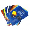
Hello Janet here sharing a trick I use all the time for transforming favourite card and paper into adhesive backed media. The sheets can be used right away or kept for future projects; with the peel-off paper backing they store perfectly.

Using adhesive backed cardstock saves time, adhesive, and often a good bit of mess. They are great for unusual shapes and batch projects. I love the  Silhouette Adhesive-Backed Textured Cardstock which comes in a wide selection of lovely colours, but not in patterns. So today I'll show you how to make adhesive sheets from your own cardstock or designer papers.


I use the Silhouette Double Sided Adhesive sheets to make them. I've tried other brands, but they tend to have thinner backing paper and I've had them stick badly to my mat when cutting and have torn and taken an age to peel off.  The Silhouette brand peels off the mat easily and having a thicker backing has the bonus of giving the paper/card additional strength and rigidity. The Silhouette sheets come in a pack of eight 8.5″ x 11″ sheets.


What You'll Need

Paper or Cardstock
Silhouette Double Sided Adhesive


Making Adhesive Backed Sheets


Place your chosen paper face down on a clean, flat surface.


Peel the yellow backing half way down the adhesive sheet.


Carefully align the adhesive at one of the corners, smooth out and then press firmly.


Trim your paper if you wish, then use for a design or store for later use.


Cutting Adhesive Backed Sheets

Place the adhesive-backed paper/card on a cutting mat patterned side up.  As you only want to cut to the backing paper, and not all the way through, your cut settings will be similar to those when cutting the unbacked paper or card. Carry out a test cut to be certain.

When your settings are correct the pieces easily peel off the backing paper.


I used the patterned paper to decorate these 5-Sided Pillow Boxes by Carina Gardner from the Silhouette Design Store.

It was quick and easy to stick all 33 pieces on, and even the patterns matched correctly!


I hope you find this useful. Let me know in the comments below, or share a picture of your finished item over on the Silhouette UK Facebook page.


Bye for now,


   Profile | My Blog | Instagram


DESIGNS USED:


PRODUCTS USED: