Monday, 31 July 2017

Using a Multicoloured Cut File


Hi all, Niki here today and you'll be please to see that I have upgraded my softward to the newest version. I'm not sure what I was scared of becuase it's very easy to use and all makes sense. Somethings are in slightly different places but on the whole I've had no troubles at all - happy days.

Today's tutorial is about using cut files that look so very pretty in the store with loads of colours, but when you open them up they are just cut lines, with no colour and look much more boring than they do on their little shop icon. I am often attracted to these files but go off them when I open them up to find all their pizazz gone.  Over the Rainbow, was one such file - look how pretty it looks!
But when I opened it up it was just the regular red cut lines - I know they are going to open like this but every time I find it disappointing!

I know the answer is to cut all the bits from different coloured papers or card but separating them all out feels like a challenge, so instead of getting myself all confused by keeping everything white, I spent five minutes adding colour to the files so I could easily see which colours the design should be and then easily identify and cut in groups of the same colour.

I started with the rainbow and went to the fill colour dropdown menu and I clicked on the relevent shape and added my chosen colour.

I then added colour to every letter. I wanted those clouds to be white but to have a coloured outline so I created an offset by opening the Offset Window and adding a small offset.

 With my clouds offset, I separated the different sized clouds and filled the bigger ones with colour.

I could then set about arranging all the letters, strips of rainbow and the clouds into groups of colour. It was then easy to arrange them onto my mat with coordinating coloured papers on my physcial mat with which to cut from. 


And then the fun part - arranging all those pretty coloured shapes and letters onto a layout!

 I hope you'll give this a try and add colour to your cut files instead of cutting them all in the same colour like I usually do!

Happy scrapping xx 

Follow me on Instagram: @nikiclaire

DESIGNS USED:


PRODUCTS USED:


Sunday, 30 July 2017

What a Corker - Using Adhesive Cork Sheets


Hello, hello, Karen here. I have had some Silhouette cork sheets waiting for the perfect project for quite some time.  They are smaller than the normal letter sized sheets of Silhouette media that you can buy so I wanted to be economic with how I used them.  This project only used 3 and there are eight 7in x 5in sheets in the pack.  Each sheet is a thin layer of cork with an adhesive backing.  As you would expect with cork, the texture is not smooth and even so I felt it would be difficult to cut intricate shapes using it and you can see that the cork shape below doesn't have clean cut lines.


I decided to cut my embellishments out from Silhouette white adhesive card and to make offset shapes in cork to back them.


Making Your Embellishments

  • I often use the Silhouette software to plan out my layout and this is exactly what I did for this one. 

  • To achieve the correct size for the cork shapes i used the offset option.

  • Once I was happy with the size of the embellishments I divided them into the pieces I wanted to cut from white card and the ones I wanted to cut from cork.


  • To cut the cork ones I drew three rectangles 5in x 7in - to represent the cork sheets, and placed my shapes in those, removed the drawn rectangles and placed the cork sheets in the corresponding positions on my cutting mat. I set my blade to 10 and speed to 1 and double cut.
Once cut, I wrote my journaling, with a Silhouette sketch pen, onto a piece of white card and constructed my embellishments to add to the page. 

I really like the effect of white card on top of the cork and am now planning to make a layout using black card as I think it will be just as striking as the white is in this layout. 


DESIGNS USED:


PRODUCTS USED:

Saturday, 29 July 2017

Make Your Own Bokeh Backgrounds in Silhouette Studio DE


Hello Janet here again with new tutorial. I love bokeh backgrounds for cardmaking and other papercrafting and surprisingly I couldn't find any in the design store. I'll show to how easy it is to make your own if you have the Designer Edition of Silhouette® Studio. Don't be put off by all the steps; you'll only need to do the designing once. Save the overlay to your library or computer and then you can reuse the bokeh overlay, with different colours and patterns, over and over again.

STEP 1: Make a Base Background

Firstly change your paper size to 12"x12" and draw a square to fit the 12 inch paper. Open the Fill window and select a gradient fill pattern.


Click on the Advanced options, and with the square selected, change the gradient angle so that the lightest part is in one of the corners (e.g. -115º).


STEP 2: Make the Bokeh Overlay

Draw five sizes of small circles to the side of the mat (press shift when using the ellipse tool, to make the shape round). Set Fill to white and line colour to clear (they will be easier to see if your background colour is grey, Edit > Preferences > Display > Background Color.


Move the set of circles to the left, select them, and in the Replicate window, Replicate tab, click the row of four symbol .


Make each set of circles have a different level of transparency (Fill window > Fill tab >Transparency). I made them 60%, 70%, 80%, 90%.


Drag them into the square and copy them twice more. Re arrange them in to space them apart and to make a pleasing pattern. Select everything by holding shift and drawing a bounding box then deselect the square, and then Group.


Duplicate the pattern by clicking, the copy right, copy below, and copy left symbols.


Select them in turn and either rotate or flip them so they are have a different orientatation (Transform window > Rotate tab > Rotate by -45º, or Object > Mirror > Flip Horizontally, or Flip Vertically.  Replace them back onto the mat (move them around until you like the effect). Then, either move or delete circles that are completely off the mat. Group the whole thing and deselect the square.


STEP 3: Fine Tune the Background

Select the square only and open the Image Effects panel > Tint tab and adjust the sliders until you like the colour and effect and click apply. Play with the other tabs too, using undo if you don't like the effect.


When you are completely happy with how it looks save the file to your library or hard drive. You can save the overlay separately to use on different coloured backgrounds. Resize the paper size to suit your printer and print as required. You can print it on to plain paper, textured cardstock, pearl card and even vellum. Of course once saved, you can also use it to fill selected shapes.


Do try it - these bokeh backgrounds look even better in reality!

See the project I made with one of the bokeh backgrounds here (available from 6th August at 6:00 am GMT).


Bye for now,


   Profile | My Blog | Pinterest | Twitter | Instagram


PRODUCTS USED:


Thursday, 27 July 2017

Box frame. Writing on mount board.


 Box frames make really nice gifts for lots of occasions. They allow us to add dimensional elements to our projects while keeping everything protected behind the glass.
 These box frames often come with a pre-cut mount but when you know you only have one mount the pressure is on to get it perfect.

Heres how I get my frames right every time.

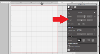
Open Studio and in the page settings menu set your page size to the same size as the mount the clever Swedish people frame I used was 9"x9" or 23cm x23cm


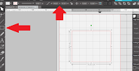
Next measure the size of the cutout where the photo will go and draw a square to match using the shape tool. I just draw any size of a rectangle and then adjust the size by entering the exact dimensions manually into the top bar.


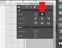
Open the Align panel and select "center of page" this will move the selected shape to exactly the center. This is now your template for this type of frame. At this point I change the color of the line, as this line will not need to cut if I change it to a different color and set the same line colour to no cut, the next time I use the template the software will remember for me not to cut this line (handy because I'm bound to forget). You may also want to color fill this box as a visual reminder.
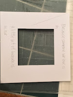
Open the text panel and select the font you would like to use and continue to add text to your project. Align the text only in the area where the mount board will be, taking care not to get too close to the edges as the lip within the frame will obscure the view of anything in that area.

Now comes the fun bit.

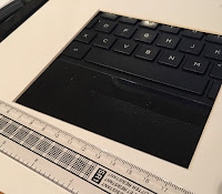
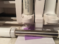
 Load your mount board on to the carrier sheet so the wrong side is facing upwards. Allow the mat to load into the machine. Use the control panel on the cutting machine to position the blade holder over the top of the mount board and place you chosen color of pen into the pen holder.
As your mount is thicker than other materials you would normally place into your machine to cut when you position the pen into the holder you may find that the pen is already touching the mount board. 
If we were to send the file to our cameo now, the pen may drag along the mount board marking it along the whole course of its path and not only where the text should be. To counteract this there is a simple trick, place a piece of scrap card below the tip of the pen then lock into position.
Click on the Send option and select action by line. Uncheck the box next to the color you drew the inner box in. From the drop down menu select sketch for the action and change the tool to pen

Make sure you have placed the pen in the corresponding holder if using a cameo 3

Send the file to the silhouette machine and allow the job to complete if the pen is still dragging, pause the machine and use a thicker piece of card to raise the pen nib a little higher. By allowing the job to complete you can check the position of your text and then make any necessary adjustments. 
When you are completely happy with the positioning, unload the mat and remove the mount board and turn it over to the correct side. Taking care to align the edges correctly reposition the mount board on the carrier sheet. Resend the file to the silhouette cutter or select repeat job on the cutter.

Position your scrabble tiles and/or embellishments and glue into place. Allow the glue to dry thoroughly before placing
back into the frame and closing up to aviod sealing damp into the frame.


 PRODUCTS USED:


Light hold cutting mat for Cameo