Friday, 29 June 2018

Queen Bee Bags with Glitter and Smooth Heat Transfer


Hello,  Janet here with another gift idea - the Silhouette is great for making quick and unique presents for friends. Today's post shows a couple of ways of using gold heat transfer materials. One project uses the Silhouette Glitter Heat Transfer alone, and the other combines the glitter with the Silhouette Smooth Heat Transfer.


Materials Used
Silhouette Glitter Heat Transfer Material
Silhouette Smooth Heat Transfer Material
Hook Tool
Pressing Pillow or Tea Towel
Iron or Heat Press
Silhouette Cameo, Portrait or Curio
Blank Cotton Bags


Zip Top Bag

I started off decorating a fabric pouch using a Honey Bee design by Nic Squirrell together with one of the new premium fonts, Salanino by Travelling Fox, both from the Silhouette Design Store.


For this project I cut all the pieces from the glitter material, adding a little crown on top of one of the 'e's in the word 'Queen'. I also wrapped some of the scrap pieces left over from weeding (with no backing on them) around the pull tab.  I then wrapped that tightly with the a piece of used backing sheet and pressed it on both sides. This made the tab glittery too, and I think it makes a nice finishing touch.


Tote Bag

When it came to the tote bag I made the design a little bigger and added the Bee Trail design by Rivka Wilkins to balance the design in the larger space.  For this project I cut the bee and crown in glitter, and the words and trail in smooth gold transfer material.  I pressed all the elements in one press, so the two types of heat transfer were pressed for the same length of time and at the same temperature. They adhered perfectly and I think the two textures compliment each other well.


I'm sure my friend will be very pleased with these (they match her personality - but don't tell her I told you so)!


Bye for now,


  Crafting Quine BlogInstagram @CraftingQuine


DESIGNS USED:


PRODUCTS USED:

Wednesday, 27 June 2018

Design of the Week - Hawaiian Shirt - 26th July 2018 I


Hello, hello - Karen here with an idea on how to use this weeks Design of the Week - Hawaiian Shirt which is a print and cut design.
I thought it would make a really cute wrapping paper and tag set.

I set about making my wrapping paper by resizing the design to 1 inch tall and then rotated it 45 degrees.  I then mirrored it to the right and duplicated it twice more.  This row of six was mirrored  below and the two rows were then duplicated three more times below.  


This was printed onto a piece of copy paper and set aside. 

Next I enlarged one of the shirts to 3 ins tall and added a small circle to the centre to make a tag.

As the only substantial white card I had was a 5 in square card I changed my design area to 5 ins x 10 ins and added registration marks.


I used this to wrap a little notebook I had bought for a friend and was delighted with how cute it looked. 


Monday, 25 June 2018

Faux Leather Paper flower brooch


Hi everyone. It's Verity here from Pretty Little Button bringing you another project. I have had the Faux Leather Paper in my stash for a while and I have been meaning to try it out. After some time I thought why not see whether I could use it to create a faux leather brooch. And, well I did just that!


Faux Leather Paper brooch detail:


To start, load your design into the studio. I used the flower, but I decided I wouldn't cut the stamen in the middle. I had planned to use a button for the inner of my brooch. To try and prevent wasting too much material when cutting the design, I used the nesting tool. Select the group of shapes you wish to nest.


Next, select the nesting tool on the right-hand side - looks like to hands clasped together. I choose to nesting my shapes using the 'cut area'.  This resulted in my flowers aligning towards the top of the mat, rotated and close together to reduce the amount of space between them. I could have done this manually myself by hand, over the nesting tool makes this much quicker for you!


When I went to send this design to cut, I made sure I did a test cut. I ended up changing my settings quite a bit - increasing my blade number and the number of passes. It is quite an old blade, so the normal settings for Faux leather paper will probably work well for you. Just make sure you do a test cut to be sure!
Once the flowers were cut out, I added some foiled detailed using Minc reactive paint, decofoil and my Minc machine. Before assembling the brooch, I washed the faux leather paper. This will help turn the paper into a more leather appearance. Once dry, I assembled the flower together using my glue gun and added a brooch pin on the back.


If this has inspired you to try this out, please post below. I would love to see it!

Until next time,

Verity


Profile Pretty Little Button Blog | Instagram | Facebook

DESIGNS USED:

Paper flower with center by Jamie Cripps, Design ID #252826

PRODUCTS USED:


Sunday, 24 June 2018

Sunday's with steph - Birthday card and layout combo


Hello all and a warm welcome to this weeks blog post!

So we have had a birthday this week - my oldest daughter has turned 17.  I am still in denial about this - like how could she be 17 when I am only 29 (ha ha ha) but she's turned it and I can't keep saying I'm 29 forever as she'll eventually catch-up or even over take lol!😂😂

So of course with her birthday present she was expecting a home-made card (a teen that appreciates the little things - I am soooooo winning at this parenting lark - only in some areas of course!!) So I chose this design: https://www.silhouettedesignstore.com/view-shape/66640 chose dome dark peach heavy card stock and cut the design using cardstock, textured heavy 80lb in the material dropdown.  Also with my machine I also cut through twice as I find this works better for me.

I backed design with some glitter card that I had and here is the finished design!


So I was left with the off cuts from the card and it seemed such a shame to throw them away!  So I decided to make a layout including them and a photo of said oldest daughter on the page with the card. 

I used some card stock with a slight shimmer and then gave it a generous spray of Heidi Swapp's colour shine and layered the offcuts up on the left-hand side of the page.  I trimmed the page down to 11 inch square, distressed the edges and backed it on some coordinating paper from the pink fresh range that I gutted first.


I then popped my photo in the bottom right hand corner with a piece of the same glitter card that I had used to back the birthday card, a wooden title and some lettering from freckled fawn.  I felt that it needed a little something else so I added a sprinkling of sequins (I personally always think you can never have too many when it comes to sequins!!)


Well I hope you have enjoyed todays blog....

Until next week

Steph x x


Saturday, 23 June 2018

Using Double-Sided Adhesive Sheets 3 Ways - with an Impossible Card

Using Silhouette Double-Sided Adhesive Sheets illustrated with an Impossible Card project by Janet Packer (http://craftingQuine-blogspot.co.uk)  for SilhouetteUk/GraphtecGB


Hi, Janet here using the Silhouette Double-Sided adhesive Sheets with a new design from the Silhouette Design Store - an Impossible Card. If you haven't heard of impossible cards I urge you to go and have a look on YouTube or Pinterest - the Internet is ALIVE with them. Using the Silhouette Double-Sided Adhesive Sheets makes the job super simple, and not impossible at all!

Using Silhouette Double-Sided Adhesive Sheets illustrated with an Impossible Card project by Janet Packer (http://craftingQuine-blogspot.co.uk)  for SilhouetteUk/GraphtecGB


It's great that there is an impossible card design available in the design store so all that pencil and ruler work is eliminated (there may be even more designs by the time you read this). This one is called the Flower Urn Bouquet Impossible Card (#267289), and is designed by Snapdragon Snippets. If you search the store using the search term "impossible card" (with the double quotation marks), you'll see that there are optional banner tags available as well as a custom-shaped envelope. Although the card file does include basic bridging pieces, I used part of the teacher/thank you banner set (#267291) as I loved the lettering and the banner shape.

The designer has a full tutorial on how to put this card together - just follow the link from the item listing in the store. Here, I'll concentrate on how I used the double-sided adhesive in this project and include a few hints and tips along the way.

I used the double-sided adhesive sheets in three ways:
  1. to make double-sided patterned paper,
  2. to make double-sided textured cardstock, and
  3. to 'glitter-ize' coloured cardstock.

Now, although the packaging includes instructions on how to cut this media, and the software has default cut settings, the methods I'm showing here use the media somewhat differently, and the cut settings will be different for each one.


1. Making Double-Sided Patterned Paper

Using Silhouette Double-Sided Adhesive Sheets illustrated with an Impossible Card project by Janet Packer (http://craftingQuine-blogspot.co.uk)  for SilhouetteUk/GraphtecGB


The panels for the card base and bridging banners were cut from patterned paper backed with a double-sided adhesive sheet.

To do this, trim the adhesive sheet to just a little smaller than your paper (either the entire sheet, or just to cover the portion that you are going to use), then peel off the white backing sheet, leaving the yellow AND the sticky layer. Just peel a little at the corner initially, and if the sticky layer seems to lifting with the white layer smooth it down and try another corner.

Using Silhouette Double-Sided Adhesive Sheets illustrated with an Impossible Card project by Janet Packer (http://craftingQuine-blogspot.co.uk)  for SilhouetteUk/GraphtecGB


Align the sticky yellow part on the reverse of the patterned paper and smooth it down. It is then ready to cut.

Using Silhouette Double-Sided Adhesive Sheets illustrated with an Impossible Card project by Janet Packer (http://craftingQuine-blogspot.co.uk)  for SilhouetteUk/GraphtecGB

A 'Kiss' cut (cutting just the top patterned layer) is the ideal. The cut settings will be slightly higher than that of the patterned paper by itself, so the setting you use for patterned paper is a good starting point.  I used Blade 2, Speed 5, Force 29, 2 Passes, but I'd recommend a test cut to find your ideal setting.


2. Making Double-Sided Textured Cardstock

Most of the remaining pieces were cut from textured cardstock, but it is only really worthwhile adding an adhesive backing to the smaller or layered parts. It is cut and used in the same way as the patterned paper (above), although as the textured cardstock is thicker, the settings need to be higher. I used I used Blade 3, Speed 4, Force 29, 2 Passes and an overcut*, so that the corners didn't snag. Again, you'll need to play around to achieve the ideal setting for your media.

Using Silhouette Double-Sided Adhesive Sheets illustrated with an Impossible Card project by Janet Packer (http://craftingQuine-blogspot.co.uk)  for SilhouetteUk/GraphtecGB


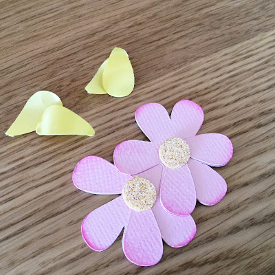
I cut the petals a little deeper so that the backing cut too by increasing the force by 2. This made it easier to colour the petal tips individually.

Using Silhouette Double-Sided Adhesive Sheets illustrated with an Impossible Card project by Janet Packer (http://craftingQuine-blogspot.co.uk)  for SilhouetteUk/GraphtecGB


* Overcut Setting

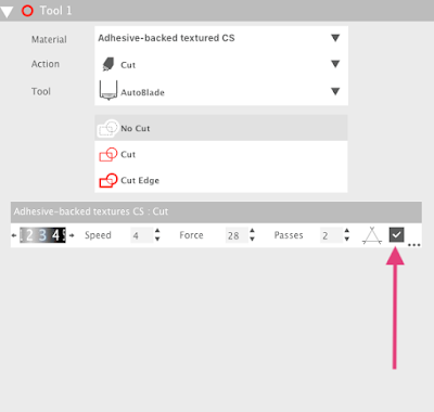
I also cut the lettering in this way, but being more intricate, the pieces required additional hand trimming. I realised that I hadn't turned the overcut function on for these, and if I had, I think that they would have cut a lot better. To turn the overcut setting on just click in the empty box to add a tick mark as shown below (N.B. this is a custom setting I've saved for cutting adhesive-backed textured cardstock).  Read more about the Line Segment Overcut feature setting here.

Using Silhouette Double-Sided Adhesive Sheets illustrated with an Impossible Card project by Janet Packer (http://craftingQuine-blogspot.co.uk)  for SilhouetteUk/GraphtecGB


3. Glitter-izing Coloured Cardstock

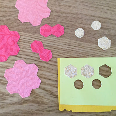
To make the flower centres I added white Silhouette Glitter to yellow textured cardstock. Peel off the white layer from the adhesive sheet and this time smooth it onto the right/top side of your card then rub it well to adhere it firmly. Adjust the cut settings to cut all the way through both layers and use the overcut *feature (this works particularly well for the non-circular shapes).

To glitterize the cut shapes, peel off the yellow layer to reveal the sticky surface and pop the shapes back into the waste part if they have come out. Sprinkle glitter where you need it and rub it gently to ensure all the required surfaces are covered. Then cover with scrap paper (the white waste layer from previous sheets is perfect as it is non-stick) and burnish (rub) with a flat edge such as a bone folder.

Using Silhouette Double-Sided Adhesive Sheets illustrated with an Impossible Card project by Janet Packer (http://craftingQuine-blogspot.co.uk)  for SilhouetteUk/GraphtecGB


Then just pop the glittered shapes out and adhere them to your project (adhesive will be required for this).
Using Silhouette Double-Sided Adhesive Sheets illustrated with an Impossible Card project by Janet Packer (http://craftingQuine-blogspot.co.uk)  for SilhouetteUk/GraphtecGB


As you  can see, the Silhouette Double-sided Adhesive Sheets are very versatile, and the non-stick backing paper is easily removed from the cutting mat, unlike other brands I've tried.


Using Silhouette Double-Sided Adhesive Sheets illustrated with an Impossible Card project by Janet Packer (http://craftingQuine-blogspot.co.uk)  for SilhouetteUk/GraphtecGB


N.B. The eagle-eyed among you may notice that in an earlier tutorial on Making your own adhesive patterned paper I peeled off the yellow backing rather than the white one. Both work, but I've found that as the white backing sheet is so much thicker, the cut settings can be lower with the method described today. I'll leave the choice to you.

Bye for now,


   Profile | Crafting Quine BlogInstagram @CraftingQuine


DESIGNS USED:


PRODUCTS USED: