Friday, 30 September 2016

Watercolour #2: Digitising watercolour photo designs for your Silhouette

Watercolour flower stickers by PaperspotUK for Silhouette UK Blog

If you search for "watercolor" in the Silhouette Design store (remember to use the American spelling of colour) you will find some easily bought files, but it is great fun, and very easy to make yourself some watercolour backgrounds to your own taste. See my tutorial post from 25th September 2016 called Watercolour #1.

Today, I am going to show you how I use an App on my Ipad to alter photos, so that I can use them in designs.

EQUIPMENT:
Silhouette Cameo
Printer
Digital Camera
Photography editing app of your choice
Silhouette Sticker paper

Using Photography Apps.

Recently I took some photos of flowers in our garden. Anyone who has used a Silhouette Cameo soon realises how versatile it is, but once you start integrating designing for the Silhouette whilst using the latest apps on your other devices, a whole new world of possibilities opens up!

There are many apps available to alter your photos (e.g. Instagram, Google photos, Pixlr etc.), but one I personally like to use is an app called Waterlogue which magically makes the photo look as if it has been painted. Below you can see the original photo, then the Waterlogued version, and the image after I digitally cut it from the photo.


To use it with my Silhouette, I want to cut out the Rose, but using the trace function on my digital photo will not work as there is not enough contrast. My answer to this problem is

  • to use the Knife tool (LHS) in Freehand mode to cut out the rose, 
  • to tidy up the edges with the eraser and then 
  • to delete the background.


Now the rose is free to be used in any way I want. I can make it into a pattern, use print and cut to cut toppers for cards or scrapping, and make stickers. Even when the rose has died, I will have a memento of its beauty! I also made similar files from Forget-me-nots and Hydrangeas.

To make stickers from these digital elements, I arrange the flowers around the edges. Here are some forget-me-nots. You don't have to tidy up the edges like this, but it is a handy technique to know and allows you to make the most of your sticker sheet. N.B. The doghnut is made with two concentric circles, you select both, align them to the middle, make them into a compound path and give it a colour set at 50% opacity. This allows you to see what you are doing. Select the doughnut and the flowers as shown below, then hit Modify/Subtract.

Make sure the sticker has a cut line around its edge. Arrange stickers on your design area. Add a message in a font of your choice. Add registration marks. Print them on a sheet of sticker paper. Select the correct cut settings within the software and the depth of the actual machine blade. Pop the sticker sheet on a mat and feed into the Silhouette. Send the design to cut and stick on anything that doesn't move! 

I am delighted with how my stickers turned out. Thank you, thank you, thank you for dropping by!

Watercolour flower stickers by PaperspotUK for Silhouette UK Blog


PRODUCTS USED:


SaveSave

Thursday, 29 September 2016

Silhouette Basics - Masterclass on Blades

Tutorial on Silhouette Blades by Nadine Muir for Silhouette UK

Hi there, Nadine here with a tutorial all about your Silhouette Blade.  A while back I was lucky enough to have a long chat with an expert on cutting here in the UK called Harry.  Harry's company manufacture the premium etching tool for the Silhouette Curio.  His tips, along with those from Brian, the fantastic technican at Graphtec, have made me more confident with how I use my blade and settings, ultimately giving me better cuts.

How the Blade Work

The Silhouette machine slides the blade left and right, whilst simultaneously feeding the mat in and out.  This combination of left and right, up and down means that it can cut any shape - remarkably accurately too!  The blade is on a spindle that rotates on a bearing. When the cutter changes direction the blade rotates around for the cutting edge to face forward so it can cut the media.  All of the cutting is done by the small triangle at the tip of the blade.

Close Up of Blade and Cutting Area.  Tutorial on Silhouette Blades by Nadine Muir for Silhouette UK
Image based on diagrams from Harry at Edward Mathias

Cutting Pressure

How deeply you cut is controlled by two things - the amount of the blade exposed and how much pressure is applied.

Imagine you have a large orange with a thick peel and you want to cut the skin but not the flesh.  You have a long dagger and you can adjust the crossguard.  If you set the guard to expose only a short length of blade, the same as the thickness of the peel, you can apply a lot of pressure and happy cut away knowing you are cutting to exactly the right level. Compare that with setting the guard back so you have a much longer blade.  In this scenario, you'd need to apply a very precise pressure to ensure you don't accidentally pierce the fruit.

I've made a little animation which hopefully illustrates this.  Notice how the blade on the right has the blade exposed to the correct depth, at low pressures, the blade won't cut through, but as long as the pressure is sufficiently high, it will cut correctly.  Contrast this with the overexposed blade on the left, here the pressure has completely perfect, otherwise it'll cut far too deeply.


Animation showing that an overexposed blade requires a very precise pressure to cut correctly.  Expose the minimum necessary blade for easier control.  Blade tutorial by Nadine Muir for Silhouette UK Blog

Golden Rule - Use As Little Blade as Possible

Taking what we've learnt from the orange analogy, we want to set our blade to the mimimal length that is needed to cut through the media.  We want the white nose of the blade holder to be pressed down on to the surface to give a consistent cutting depth.

In the diagram below you can see that the blade on the left is set too short and won't cut through the media.  In middle blade is just right and the right hand blade is too deep. 
Correct Blade setting for cutting.  Tutorial on Silhouette Blades by Nadine Muir for Silhouette UK


When I first started, I often put my blade setting a notch higher, thinking somehow it would cut better or with more pressure.  Winding back the nose does not increase blade pressure nor does it increase blade length or bring it closer to the media it simply EXPOSES more blade.

Here are some reasons why this isn't a good idea:
  • Notice how the triangle is much larger onthe overexposed blade on the right?  This means that a bigger the surface area that needs to be rotated, making the quality of your cuts less accurate.
  • The machine too will be under more wear, as all the pressure is on the blade itself and not the white nose of the blade holder.
  • If the pressure is too high, which we know is hard to perfect with an overexposed blade, this will cause:
    • the mat to be cut into and damaged shortening it's life
    • backing paper on vinyl or stickers will be cut, making it harder to weed and remove.
Top tip
Your blade comes with a little grey ratchet to change the blade setting, but the machine also has one, just to the left of the mat loading position - handy!!

Cut Settings In Silhouette Studio


The blade pressure is controlled within Silhouette Software, within the cut settings.  Referred to as Thickness, it ranges from 1 to 33 and each increment equates to 7 grams of force, so can cut with a maximum of 230 grams of force.

Cut Settings in Silhouette Studio.  Tutorial on Silhouette Blades by Nadine Muir for Silhouette UK


Harry's top tip
Think more about DEPTH rather about than pressure – don’t be afraid to use more pressure than the blade needs to cut the media - if only the correct amount of blade is exposed it simply cannot cut too deep because the nose of the cutter (if correctly set) will act as a stop and prevent it from penetrating further.

Test Cuts

There is a test cut button in the Cut Settings window(see the screenshot above). When pressed, the machine will cut a little square with a triangle inside it.  You want to will be able to lift the triangle from within the square of the test cut but have no marks from the test cut on the cutting mat itself, or at most a very light outline just on the adhesive.  Start with a light thickness, say 8 and work up from there with some test cuts to get the perfect pressure.
Top tip
The arrow keys to the left of the test cut button on screen are just the same as the ones on your machine. They will allow you to navigate the machine to the position that you'd like to make your test cut on.

Separate Blades for Different Media

My mum and granny used to despair if they caught me cutting paper with their fabric scissors.  The same principle applies here as paper is very abrasive, so a blade has been used on paper, will not cut fabric well.


Top tip
This is exactly the same as the regular black ratchet blade.  Silhouette have just made the housing blue to help you keep them separate.  Even if you don't cut fabric, but find these blades on sale cheaper, you can use it just you would the regular one.
You can take this principle a little further, so for example I have a separate blade for vinyl, paper and fabric.

Blade choices 

Along with the regular black ratchet blade and the blue fabric one, there is a premium blade that lasts three times as long.  The Curio and Cameo 3 have a deep cut blade for thicker media such as foam.

The Cameo 3 also hase an auto-blade which automatically adjusts the blade by “punching” itself up and down in the corner of the material until the right blade depth is achieved.  I'm excited to say I'm the proud owner of the new Cameo, so if you guys are interested in some tutorials on the new features of the Cameo 3, comment below and we'll be happy to oblidge.

Blade Care

All machines have limits – if you try to cut media that the machine does not have the power to cut exposing more blade will not help you will just damage blades.  This is why it is not possible to cut metals such as silver or steel.

Blade are fragile and any most damage can't even be seen with the naked eye.  Don't allow anything to touch the blade other than the media that you want to cut.  I read that running the blade along a ball of tin foil would clean and sharpen it - this is very bad idea!  For more information, this link is useful http://www.edwardmathias.com/plotterbladecare.html


Masterclass complete

I started this tutorial to cover the basics, but I think it became more of a masterclass!  As Harry says, you can have the most luxurious fountain pen in the world, platinum decorated with diamonds and rubies, but if the nib is chipped, the end result is ruined.  So, your machine is only as good as your blade.

I hope my tips will help you care for your blade, allowing you to produce high quality cuts and also save time weeding.  For extra info click here to see Graphtec Brian's Guide for Setting the Initial Depth.


Wednesday, 28 September 2016

Fly High - a stitched scrapbook layout

Fly High - a stitched scrapbook layout

Hiiiii

It's been a while but I'm back with another stitched page share for you. It's a short post but lots of pictures and a link to the tutorial.

Here is the layout...


This is the shape I used...


Isn't it adorable! I didn't want the text at the top as it idn't suit my layout so I just deleted it.

I knew I wanted to stitch this in white and then have blue and white flags just for a little pop of colour. I used my silhouette to make the stitch holes, I have made a few stitched layouts before so click here for the tutorial on how to make any cut file into a stitched template!

Using the cameo to create the stitching template helps you to get a lovely even stitch that is delicate at the same time.


Here are some close ups for you...


For the journaling I like to type it out in a word document and then chose a few different fonts on one page then when it's printed out I get to choose the one I like best!


It turned out pretty good!...


I added in a few details like puffy stickers and flair badges and a cute photo of Lily and then backed it all on to a patterned piece of paper to create a border for the white card stock.

I always love a stitched layout, have a go it's fun.

I'll be back soon with another post for you soon

'Til next time

C x


Products Used:
PRODUCTS USED:


Light hold cutting mat for Cameo


Tuesday, 27 September 2016

Glitter HTV and Markers - make Unicorn Bracelets


Hello Janet here again.

Today I have a colourful children's project for you - jewellery, glitter  AND unicorns!

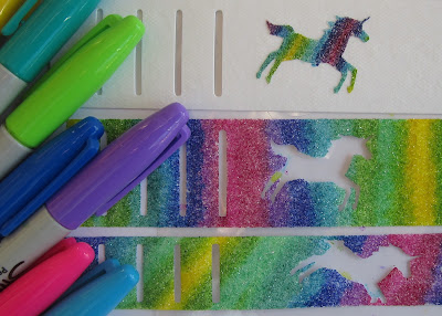
I made these bracelets using the Kid's Unicorn Bracelet file by Mini Lou, who has lots of files in the store which are great for kid's projects. These bracelets were made up using the Silhouette Faux Leather which is stronger and longer lasting than paper. The bracelets won't last indefinitely, but they should outlive a regular paper version. The colourful parts are made by hand-colouring Silhouette white glitter heat transfer material with permanent markers and then fusing it onto faux leather. The Silhouette brand HTV has a rougher glitter texture than some, and takes the colour well. The heat used to adhere the glitter also sets the colour. Rainbow colours were the obvious choice for these unicorns.


WHAT YOU'LL NEED

Silhouette Cameo® or Silhouette Portrait®
Unicorn bracelet pattern download (#102081)
White Silhouette Glitter Material
White Silhouette Faux Leather
Weeding Hook
Heat Press or Iron
Permanent Markers (e.g. Sharpies)


I made a few variations:

  • Rainbow glitter bracelets with white unicorns
  • White glitter bracelets with rainbow unicorns
  • White bracelets with rainbow unicorns and a name

They all use the same basic method and I'll share here.


STEP 1: PREPARING THE FILES

Open the bracelets file, then ungroup and delete the bracelets you don't want. I just made the larger sizes.

For the glitter layer, work with the unicorn bands (coloured pink in the file). To make the glitter layer we'll need an internal offset of the unicorn band, but we don't want to include the unicorns and the slits - they are already the correct size. To do this release the compound path (select bracelets, open Modify > select Compound Path, Release).


Then select the outer shape and create an internal offset (select bracelet outline, Offset > Internal Offset  (options: Round, offset distance =1.5 mm for the larger and 1.1 mm for the smaller bracelet). Click Apply.


Select the unicorns, the slits and the new shape and make a compound path. 


Delete the outer shape (pink). Repeat for the smaller bracelets. 


At this stage you can mirror the pieces and you must mirror if you have incorporated any lettering (Object > Mirror > Flip Horizontally). 


STEP 2: CUTTING THE FILES

Place the material on a cutting mat with the shiny side to the mat.  Cut from the glitter material carrying out a test cut if you haven't used this material perviously. Cut settings for Heat Transfer Material Glitter are in the later versions of the Silhouette software only, but may require less pressure and blade depth. Ideally, the blade should cut through the top layer, but leave the bottom layer (carrier sheet) intact. My picture shows version 3.6.57.


Cut the plain bands (coloured blue in the file) from faux leather paper. I chose the default settings for Faux Leather Paper in the Cut Settings Window. The test cut didn't quite cut through, so I increased the blade depth by one (my mat has lost some stickiness). You may not need to, but do use the test cut function if you haven't previously cut this media.

Rather than place the faux leather on the mat as a roll, trim and attach a piece a little larger than that needed for the pieces and attach the edges to the mat with tape (otherwise it has a tendency to lift up from the mat).


STEP 3: PREPARING THE PIECES

Preparing the pieces prior to colouring is the same for all methods as follows:
(A) Weed the excess glitter material from around the bracelets.
(B) Trim the long sides closely by hand (this helps with alignment).
(C) Gently peel the non-unicorn part off the backing.
(D) Keep it in one piece and try not to stretch it.


If you decide to add wording, don't forget to retain the interior parts of any letters.


STEP 4: DECORATING THE PIECES

The glitter pieces can now be coloured. Choose whether to colour the background or the unicorns.

If you choose to colour the background, the glitter material should be coloured before it is applied to the bracelet. Place the pieces on scrap card or other surface that won't be damaged by the permanent markers. This is a great activity for kids (please heed any age recommendations and warnings on the packaging of the permanent markers).


If you choose to colour the unicorns, they are best applied to the faux leather bracelets before being coloured.

Colour the bracelets however you like. They are quite forgiving as the next layer will cover up any colouring over the edges.

NOTE: The colouring process is quite hard on the marker tips, so it's probably not worthwhile risking damage to your 'best' markers!


STEP 5: ASSEMBLING THE BRACELETS

Position the unicorns so that they'll match up with the background when it is applied later. This is easier if you have accurately trimmed the outside edge of the transfer backing before removing the non-unicorn part.


Apply the glitter transfer material to the faux leather with a heat press or iron following the directions on the pack.  


Now the bracelets are now complete! Have a go yourself - or get the kids to try it out at a crafting party or to keep them entertained during the school holidays!


   Profile | My Blog | Pinterest | Twitter | Instagram


DESIGNS USED:


PRODUCTS USED:

Monday, 26 September 2016

Making your own Wedding stationery - Part 2


Hey there, it's Sara. This is part 2 of my guide on how to make your own wedding stationery. IF ou haven't seen part 1 yet, you can find it here.  I wanted to show you today how you can make place names and menus using the logo and invitations we used on part 1.


Supplies needed:

2 LABELS Design (ID #143087)
AUBREY FONT font ( ID #122828)
White card paper
Silver
card paper
Glue dots
Swarovski crystals
Glue


MAKING THE PLACENAMES:

I have chosen here to work with cherry blossom as they are a classic and elegant flowers for weddings. 

Start with using the same label shape as we did on the invitations. Ungroup the file and delete the other shape.


Resize it to be about A5 size.


Create an offset shape of the label, that will be the background paper for the menus.


Put the offset design on the size and now we can start working on the menu design.

First I used the rhinestone effect to create some cutouts on the top and bottom of the menu.
Make a small rectangle and then choose the rhinestone effect using Linear Fill.


Release the rhinestones (step 1), resize the middle circle to 20ss (step 2) and the two on the edges to 6 ss (step 3). 


Now you can group them together and copy the design to have in the bottom as well.


Now you can add the text. For the text I used Aubrey Font and Times New Roman.


Resize the page size to printer size, and add registration marks.


Print and cut your menus and cut your background for the menus.  


Use glue dots or normal glue to glue them together.


THE END RESULT: 
An elegant wedding menu, you can also add rhinestones if you like instead of the cutouts in the menu as I have done in the main picture in the beginning of this blogpost.


DESIGNING YOUR PLACE CARDS:

Here I am using the same label shape as the above.


Remove the color and resize it to about A5 size.


Using the Outline cutting tool, cut the top of the label shape.


Keep the top part of the shape and delete the rest of it.
Create a rectangle that is about 10 cm tall and 9 cm wide.


Now add your cut label shape to the middle of the rectangle.


I copied the same cherry blossom design from the invitations and added them to top of the label shape.


I set the page size to my printer page and added registration marks. 
Then you will see on each page you can have two place cards. You can now either add the names of the guests using the Aubrey font, or print them out blank and handwrite the names. 


End result is a full wedding stationery, which you can easily use same layout and steps to make your own guestbook layout and more.

Hope this tutorial! If you have made any wedding stationery using your Silhouette machine, please feel free to share it with us! Tag us on Instagram or comment on this blogpost.


`


DESIGNS USED:


PRODUCTS USED: