Showing posts with label Fonts. Show all posts

Wednesday, 29 May 2019

Wedding Frame using Printable Canvas

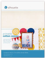
Hello, hello - Karen here with my usual Wednesday post.  This week I have used printable canvas in my project.  I must confess that I haven't really used this before but was thrilled with how well it printed (I used an inkjet printer) and also how nicely it cut.

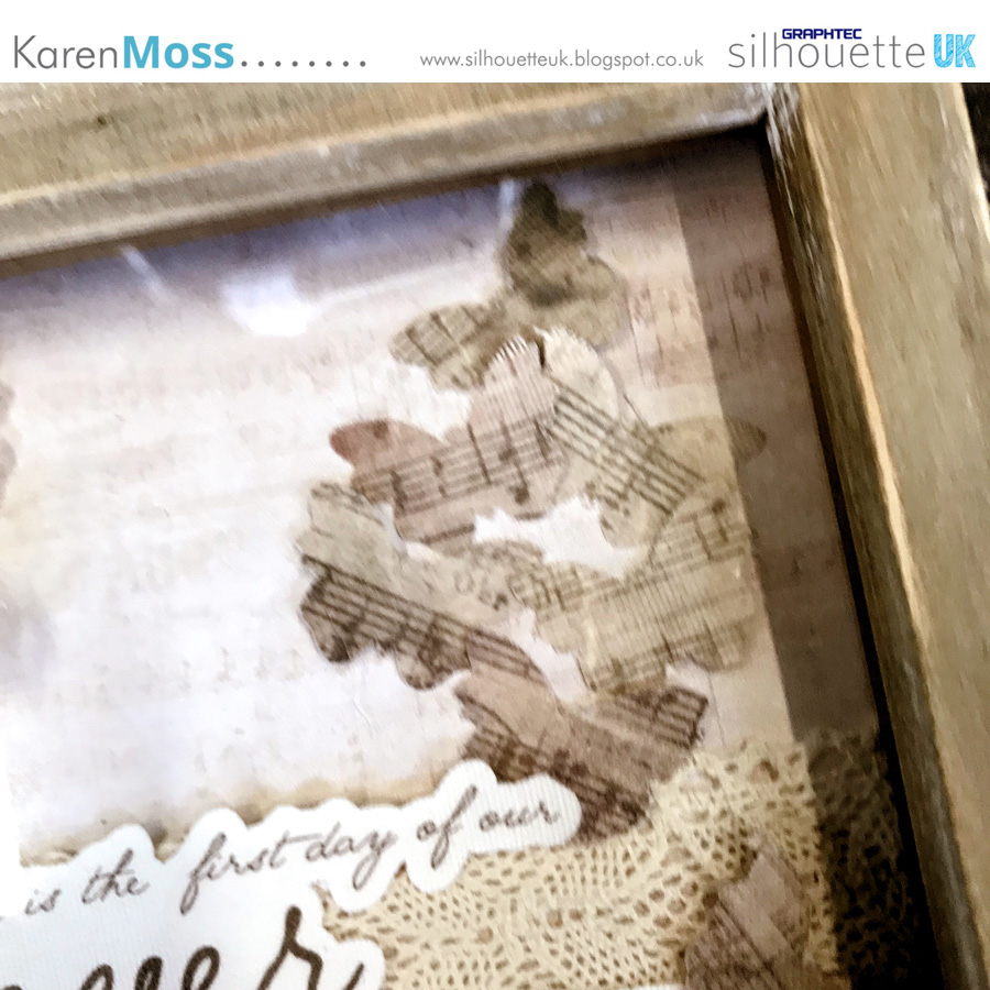
For my project I have made a frame with a phrase added that is suitable for a wedding gift.


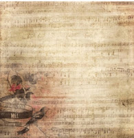
I started by choosing a background to print and resized it to 8ins square. 


Then I reduced the depth of colour by using the colour palette tool and sliding the transparency down to 33%.


I printed it out cut to size for my background.

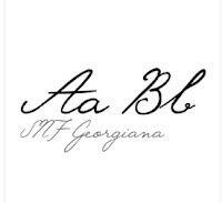
To decorate my frame I found a suitable phrase on Pinterest and used SNF Georginana to write it - I wanted a fancy font.


I typed it in two different sizes and moved them about until I was happy with how they looked.  I then added an offset.

I wanted to have something additional to decorate my frame and decided on some butterflies but I wanted them to coordinate with the rest of the design.


I used the knife tool to cut the darkest section of the background and added it below my phrase. Then I added some butterflies.  As this was a solid section of printing I knew that the butterflies would be completely covered with the pattern and there wasn't a need to add an offset. 


Once they were all cut all that was left was to add them to my frame, together with some lace and purchased flowers. 


DESIGNS USED


PRODUCTS USED
 

Monday, 18 March 2019

Back to basics: Welding fonts & Glyphs


Hello, it's Verity here from Pretty Little Button. Its another episode in my mini back to basics series and this time I am focusing on welding fonts and how to use the glyphs/flourishes that they come with. If you plan of cutting out your text, then knowing how to weld your font is very important so it doesn't cut out all the pieces individually and mess up your text. Also, many fonts come with glyphs and flourishes that can really change up your text and possibilities can be endless, so it is a great tool to have in your belt if you know how to access them and use them. I used all this information to create some cute modern labels for some of my craft tubs just to spruce up my craft room a little. So have a look around you and see what you can spruce up with some vinyl and text!

Back to basics: Welding fonts & Glyphs process: 


Use the text tool add your text to your design space. 


Using the text style box and all your titles selected to change the font to your chosen style. The font used here is Antelope. 


To add flourishes/glyphs to the front and end sections of your words, you need to use the 'Glyphs' tab in the text style window.


In this tab, you will find a scrollable window contains a variety of characters. The characters at the top will contain plain alphabet and number options, but once you scroll past this you will find additional letters with flourishes to them. For 'Paintbrushes' I selected this p below, adding a flourishing to the beginning of the letter. 


Then I altered the remaining letters including the s with a flourish lopping back over the s character. Make sure you think about the position of the flourish and the position on the character within the word.


Once I was happy with all the flourishes, the next stop was to weld the font. As you can see above, there are many areas where the letters overlap and we don't have a continuous cut line. If you were to cut the font out like this, the vinyl would be in bits and you would struggle to adhere it correctly and without any of those cut lines showing. 

  Now it is important to note, that when you weld font you can no longer edit the text. So if you know you may wish to change the text later before you cut it out, leave the welding until the end. 


Select the modify panel in the right-hand toolbar to open the modify window. 


With your title selected, click the 'weld' button in the window. 


When the items welds' anywhere the to items overlap join together to create one continuous cut line. As you can see above, all the letters in 'paintbrush' are now joined, whereas the letters in 'mixed media' are still overlapping as they are not welded together. 

These titles were cut out of self-adhesive vinyl in a lovely teal colour. Once the titles were weeding, transfer tape was used to position the titles on the tubs and adhered down with a burnishing tool.

Back to basics: Welding fonts & Glyphs photos:


If this has inspired you to try this out, please post below. I would love to see it!

Until next time,

Verity


Profile | Pretty Little Button Blog | Instagram | Facebook

FONTS USED:

ANTELOPE by Polem, design ID# 251515

PRODUCTS USED:
    

Saturday, 23 February 2019

Faux Letterboard Card


Hello, Janet here from the Crafting Quine blog. Today I have a faux letterboard card for you. I've been inspired by all the letterboard dies around at present, and it struck me that the Silhouette Adhesive Corrugated Paper would be perfect to give a similar effect with minimum effort. The letters have been cut on the Silhouette too, with single and double height letters and some extra script and icon embellishments. There is so much versatility for all kinds of cards with this design, so I do hope you'll try it out.

Selecting the Design
The base of the card is one of the 3D Frame Cards by Lori Whitlock. I used design ID #101975 which has a Christmas theme, but any of the similar designs will work. To find them all search for '3D Frame Card' in the Silhouette Design Store and filter by Artist, selecting 'Lori Whitlock'. Most of them appear at the top of the page. Select one that has a panel on the front of the frame if you want to add a wood patterned panel as I have done.


Preparing the Frame Card Base
Ungroup all the file parts, and discard all but the base card, the frame, the frame panel, and the interior panel. I increased the size of these remaining pieces so that the 3D frame piece would just fit onto a piece of 12" x 12" textured cardstock. This gave a finished card of 17cm x 13.25cm, which made it easier to cut and place the letters. However, it did make the accompanying box piece bigger than 12" x 12" so be aware that if you make it this big you'll need A3 cardstock and the larger sized cutting mat to make a box to fit. The interior panel was cut from the Silhouette Corrugated Paper, which gives the letter board effect. It is self-adhesive and easiest to apply to the card frame while it is flat, before folding it up.


Preparing the Lettering
Choosing the correct font is critical for the letterboard effect. I cut the basic black letters in a sans serif font that was pre-installed on my computer from black cardstock (this one is similar to Ariel). Just avoid a font with a circular 'O', as a font with an oval shaped 'O' (and other rounded letters) generally fits in the limited space better. I cut two of each letter and layered them together. The larger letters are LW Trendy font with the background shape cut from white cardstock and the cutout layer cut from Silhouette Textured Translucent Vinyl, giving a glitter plastic-y finish to those letters. The word 'Birthday' was made from LD Charming Bold font. I recommend choosing a favourite script font that maintains a similar width through the letters (that doesn't get too narrow). However, if your chosen font is too narrow, use a small offset to thicken it up.


For the little precent icon, I chose the letter 'a' from the LW Birthday Dingbats font. I removed some of the detail, by releasing the compound path and deleting all but the outside line and the bow loops, grouping it all together again (if you want it to display correctly on the screen make it into a compound path again, it will cut correctly either way). Cut the present from the same materials as the 'GREAT DAY' words, layering the vinyl on top of two copies cut from white cardstock.


Finishing the Lettering
If you have a problem getting your letters to align (as I always do), use this little alignment trick I have for you. Arrange the letters on your mat on a rectangle of the same size as the frame interior, add the cut line shown in blue (below), and cut the whole thing from a piece of scrap card.


Use the scrap piece to align the first row of larger letters.


Then use strips cut horizontally across the centres of the other words to align each row in turn.


Once all the letters are adhered I add liquid glaze to the black letters to give them a more plastic-y appearance. The translucent vinyl would be great for this too.


Making the Box
The cut file for the box is included with the design. If you increase the size of the card as much as I did you'll find that the box is too big to fit onto 12" square cardstock. In which case use A3 card and the larger sized cutting mat. This box was cut from a background pattern (design id #171187) printed onto A3 cardstock. By aligning the pattern and the design to the centre of the card I was able to print THEN cut, so a Print & Cut was not necessary.


The box is the perfect finishing touch. I can't wait to give this card to its recipient!


Bye for now,

  Crafting Quine Blog | @CraftingQuine


DESIGNS USED:
 3D Frame Card by Lori Whitlock  Blue Wood Grain Pattern by Lori Whitlock Handpainted Watercolor Stripes Background By Angie Makes  LW Trendy Font by Lori Whitlock  LD Charming Bold font by Scrap N Fonts  LW Birthday Dingbats font by Lori Whitlock


PRODUCTS USED:
 Silhouette Adhesive Corrugated Paper  Silhouette Textured Translucent Vinyl  Silhouette Cameo 3  Silhouette Cameo Large Cutting Mat  Silhouette Studio designer edition