Well isn't it pretty!
The first thing that's new is the loading screen with a new graphic.

If you're updating when your software loads, you will notice a window on the right with your recovered files, this isn't in itself new but now you can move this panel anywhere on your screen that suits you.
At first look, there is not a great deal different with the software, however, there are some things that have been added to improve the usability, We can now make the buttons bigger which I for one greatly appreciate. This is done by clicking Edit then selecting Preferences. A new window will appear allowing you to change various things, like choosing cm or inches much like in the previous versions, but now if we look in the Display section, not only can we change the colour theme but we can also change the size of the buttons.
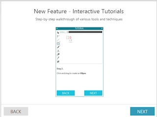
There is also a handy interactive Tutorial feature which is accessed through the help button on the top toolbar. This feature offers instruction in the format of a short animation to guide you through starting off with your machine.

Switching between Design, Store, Library and sending to your silhouette are all done in the top right of your screen as shown below.
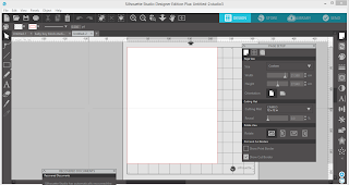
 A new project screen will look like this with a window open with options to select your page size, the mat your using and the orientation. By selecting different tools, new windows will pop up on your screen, these screens can be simply closed down again or if it's a tool you use often leave it open and move it around the screen to a position that suits you best.
The next big thing is the trace feature has been updated.
we now have trace by colour and magnet trace which will be a whole blog in itself.
The updated process for sending your files to be cut is a much more linear process which should mean we make fewer mistakes by forgetting to change little things. Options for your blades are now beneath your virtual mat and the first screen to appear on the left is a comprehensive list of media types, simply select your media type (or add a new one) for each of your blade housings. At this point, I recommend using the test cut function for each of your media types, we can now use the arrows to position the blade over each different media before clicking on the test cut button.
It is now easy to load different media onto the mat to cut at the same time while telling the software how to treat different media in the same pass.
I highly recommend this upgrade, I've been using it for some time now and find it a much smoother process with less opening and closing of tools.
Well, there are further updated features if you have DE or above but for now, have some fun playing and get a feel for the layout. If you use other graphic programs you will find the new version very familiar and will be flying in no time.
Crafty hugs X
DESIGNS USED:
PRODUCTS USED: |


Is this upgrade for the cameo 3 or can it be used by the owners of cameo 2
ReplyDeleteIt's for everyone Pauline x
ReplyDeleteWell taken the leap and it is certainly different but in a good way
DeleteI'm a shrinking violet when it comes to updates, will hold off for a while....
ReplyDeleteI normally wait as well Ruth but I heard of some real exciting additions in this update and I have to say I'm impressed I haven't had any problems.
ReplyDeleteI am liking the update a lot but for the life of me I cannot find the resize tool to resize exactly.
ReplyDeleteLook in the top tool bar the second row under the undo arrows you can enter your measurements there and lock unlock aspect ratio. Sorry can't comment with a photo to make it easier to find
Delete