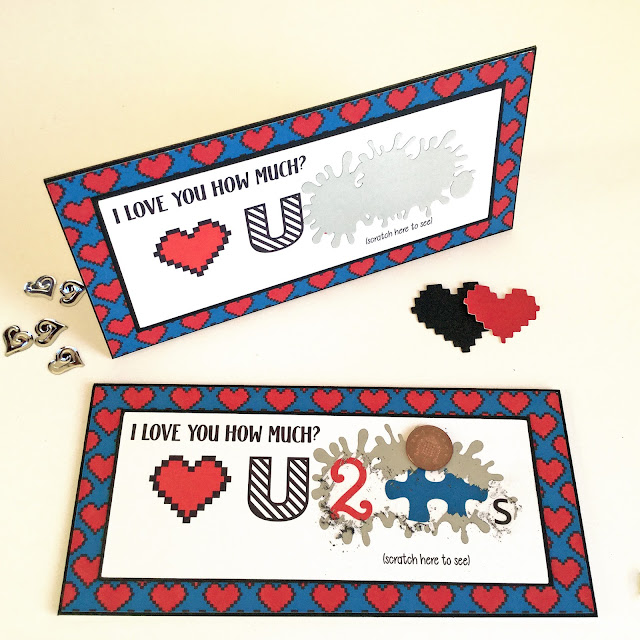
Hello, Janet here sharing a couple of Valentine's cards I've made using one design idea, but with a selection of different materials and methods.
These cards were inspired by some puzzle pieces I had left over from another project and a pack of Silhouette Scratch-Off Sticker Sheets which I hadn't yet tried.
SQUARE CARD
The square card has a Print & Cut background using the Pixel Heart background by Studio Ilustrado. It is adhered to a 5-inch square card blank and a black mat.
The white card front has a cut out '2' in LW Perfect Type. It is backed with a small rectangle of red card and then adhered to another black mat.
The heart is the Pixels Heart by Studio Ilustrado. I adhered multiple layers of each colour to give more dimension.
I cut the 'U' from black gloss vinyl using LW Stripes font along with an 's' from a regular sans serif font and applied them both with a small piece of 'de-stickied' transfer tape.
Finally, I attached two layered puzzle pieces, a single piece from Lori Whitlock's Square Puzzle file.
RECTANGULAR CARD
This rectangular card is scaled to fit a UK DL envelope, which takes A4 folded into three (I used 2/3rds of a piece of A4 card stock, folded in half). It also has a Print & Cut background and is adhered to a black mat.
The white card front is a Print & Cut using the same elements as on the square card (above) but printed in a line. The additional text is typed in LW Title and LW Cheerful fonts. It is adhered to another black mat.
The blot shape is made up by welding together several of the shapes from the Splats file by Sophie Gallo.
This blot was cut from one of the Silhouette Scratch-Off Sticker sheets. The Silhouette cut this quite intricate shape without any difficulty, but I found the default settings were a little high. The settings I used can be seen in the picture below. (Note: Your ideal setting may vary, it is advisable to carry out a test cut first to establish the setting for your machine). Once cut the sticker was peeled from the backing (the sticker is black on the reverse) and positioned carefully over the letters as shown above.
I hope you like these cards and that they have given you some ideas for mixing up different techniques and media on your cards.
Bye for now,
DESIGNS USED:

|

|

|

|

|

|

|

|
PRODUCTS USED:

|

|

|

|


No comments:
Post a Comment