

Hello, Nadine here today with a guide to designing papercuts that incorporate wording. I am addicted to beautiful fonts and in this tutorial I'll give you the lowdown on how to use different typefaces within a papercut design. In the picture above, I have used a number of different fonts and techniques and we will cover them all in this tutorial. I have also selected some of my previous projects and just a few of the many beautiful designs available from the Silhouette Design Store to illustrate techniques.
Next week, I'll be back with a step-by-step tutorial on how to make the following papercut which I designed as a wedding present for my close friends' Emily and Callum. I will also include a free Silhouette compatible cut file with the heart frame to help get you started.

General Tips
My first tip is to use ascenders and descenders to join your words. Ascenders are the parts of a letter which extend above the normal height of lowercase letters. Similarly, descenders extend below the baseline.In my example, notice how I have joined the 'P' and 't' ascenders from the word 'Papercut' to the line above and lower case 'p' descender to the word below.

Use connectors, such as a skinny rectangle to join diacritics. Diacritics are the dots in the letters 'i' and 'j' or accents over vowels.

The following design #40914 by Jamie Koay illustrates both the idea of joining words with ascenders and descenders and connectors on dots.

Script Fonts and the Weld Tool
Script fonts mimic 'joined-up' cursive handwriting and can vary from formal calligraphy to more casual, looser writing.Script fonts are naturally very well suited to papercuts as they form continuous shapes within each word with minimal effort, all you need to do, is use the Weld tool which is the most important tool of all when making papercuts.

See how the Weld tool merged the letters from the word 'With' together? Without this, the Silhouette would cut out all lines, even the overlaps and you'd end up with lots of loose letters.
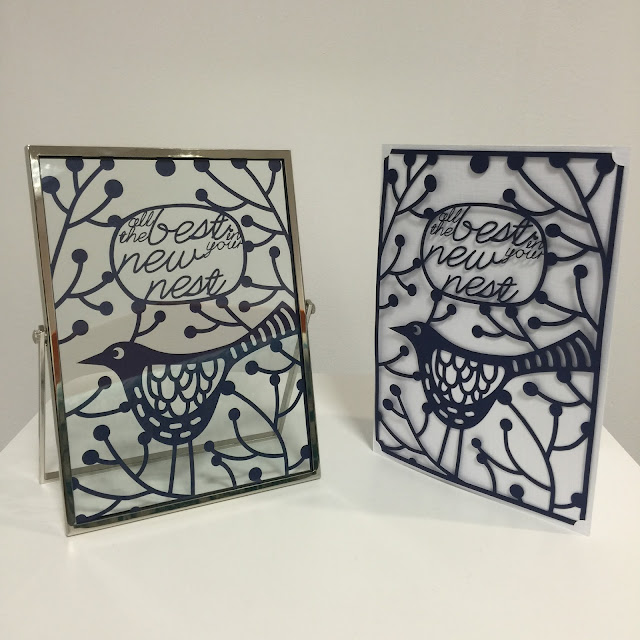
I used the font called Lovely Script by Gina Marshall in conjunction with Nic Squirrell's Bird Design to create the message 'All the best in your new nest' in the papercut below:
Here is another design in which I used the Edwardian Script ITC which comes free with Microsoft Office to make a papercut for my fabulous granny Dilys:

Serif fonts and Character Spacing

Serif fonts are popular for papercuts when using an approach in which each letter is made to touch the next. The reason why these fonts work better than sans serif fonts is because these lines and bars provide good joining points, whilst still allowing each letter to 'breathe' and have definition. See in the example below how the word 'definition' in serif font remains readable, whereas the sans serif font becomes very difficult.


In my recent tutorial which showed how to apply vinyl to glass, I used a serif font for my text and made each letter touch the next.

Here is a tag I made for the papercut wedding gift. I used a closely kerned serif font combined with some connecting bars.

Uppercase and Support Bars
A simple way to create a papercut is by writing your text in uppercase and weld a long slim rectangular bar at the top and bottom of the lettering. Serif fonts can be used, but often cleaner fonts allow the letters to be seen more clearly. I used this approach for the word 'DESIGN' in my example papercut.
Here is an example by Jennifer Wambach #37206.

Stencil Fonts and Negative Space
Until now, all of our designs have the letters in paper and the spaces around cut away. It's possible to reverse this and have the letters cut out instead. If you would like to keep the floating shapes such as the holes in 'o' 'e' and 'a' (fancy-pants typography name is counters) then use a stencil font.
Here is an example from Ty Pilcher #44369

It's quite trendy now to have a casual, hand cut look in which the inside shapes are missing. For example this design from Emily Dyer

Sans Serif Fonts and Bunting Strings
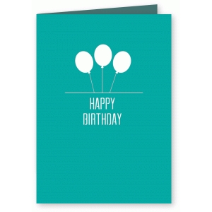
Finally, we have the approach that I'll be covering in detail next week - hanging text from strings in the style of bunting.

I hope that you have found this guide useful and are inspired to experiment with different approaches. Do you have a favourite technique or have any extra hints? If so, I'd love to hear from you in the comments below. See you next week for part two!

Thanks Nadine. This is a very useful guide.
ReplyDeleteNadine these are absolutely gorgeous. I saw similar ones in a gallery in Newcastle and because they were hand cut they cost an absolute fortune. This is such a beautiful, quick and cost effective way to make paper cuts. Shall definitely be putting this on my ever growing 'list of things to do'.
ReplyDeleteThanks Karen. Sure have a shot with next weeks tutorial :)
DeleteHola Nadine, esta técnica es una de las que uso habitualmente, es realmennte vistosa y bella. Me hubiera encantado enlazar alguna foto de mis trabajos para que los hubiera visto
ReplyDeleteSaludos afectuosos desde España
DeleteHola Ann y bienvenido. Nos gustaría ver algo de su trabajo . ¿Tiene un enlace web a una foto ?
Hola Hilary, mi web está en construcción y algunos trabajos los subo a mi página de Facebook, espero pronto tener la web para hacer una galeria con todos ellos
Deletehttps://m.facebook.com/story.php?story_fbid=1738994016332863&id=1633866046845661
Greetings from Scotland to Spain Ann! Thank you Hilary for the reply, I was worried that google might give me a comically wrong translation! I've had a look, lovely work Ann :)
DeleteNadine my son and his Fiancée have asked that I make their wedding name cards and they want the names of each guest cut out. Now I may have a chance of succeeding! Thank you Elaine
ReplyDeleteThats brilliant news Elaine! Which approach are you going to go with?
DeleteGreat tutorial. thank you
ReplyDeleteThank you very much for this. Such a helpful tutorial and clear teaching .
ReplyDeleteWhat a brilliant tutorial,will definitely be having a shot at doing this
ReplyDeleteVery enlightening stuff.
ReplyDelete