To make all three layouts you will need:
Layout 1
Silhouette Cameo
Silhouette Pen Holders
Permanent Pen
Water Colour Pencils
Washie tape
Flowers either purchased or cut with your silhouette.
White card
Layout 2
Silhouette Cameo
White card
Coloured spray Mists
Large pearls
Pen for journaling
Layout 3
Silhouette Cameo
Black and gold card
washie tape
White Silhouette Sketch Pen
Your choice of embellishments
LAYOUT 1
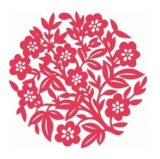
- For this layout I opened my design and centred it on my page. I then drew a circle around the design and changed in the LINE STYLE MENU changed the line to a dashed one.
- I then used a permanent pen in a Silhouette pen holder to draw my background and circle, using the normal settings for card but changing the Ratchet Blade setting to Sketch Pen on the CUT SETTINGS menu.
- I needed to amend the finished design by hand drawing in lines where necessary as the shape is designed to be cut and so some of the leaves and flowers run into each other and need to have lines drawn to separate them.
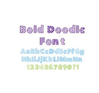
- Next I coloured my design with water colour pencils and wrote my title using Bold Doodle sketch front. I changed the lines of my words to 'No Cut' in the CUT SETTINGS, added a small outline using the offset option and cut the title out. I coloured this with my water colour pencils too.
- To finish off my page I added a photo, some washie tape, flowers, gold gems and some journaling.
LAYOUT 2
- For this layout I decided to cut the shape from white card and use it as a mask. I cut the shape and sprayed temporary adhesive to the back and attached it to another piece of white card.
- I then sprayed three different colours of mists onto my page.
- I also cut a title from white card and sprayed it pink.
- Next I peeled away the cut section to reveal the white beneath.
- I thought that the coloured piece that I had removed was far to pretty to throw away so decided to cut it into sections to use to embellish my page.
LAYOUT 3
- I wanted to try something completely different for this layout and thought I would make a doily for my page.
- I reduced the size of the shape in the SCALE WINDOW to 4inches.
- I used a font I found on the internet called BlackFat to write my title. and then cut these out from gold card.
- Next I opened a new design page and added an 11.5 inch square and changed the line from solid to dotted (as in layout 1 above).
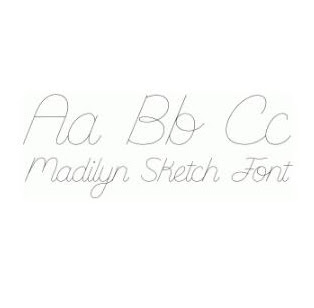
- At the bottom of my page I wrote my journaling using Madilyn Sketch. I used a white sketch pen to draw the border and write the journaling. Unfortunately, my pen started to run out as it was writing but in a way I quite like that it fades towards the end as it adds to the secrecy of the last few words.
- I added my gold shape to the top left of the page and the gold title to the top right and embellished the rest of my page with a tag, metal heart, three roses, a purchased die cut circle, small pearls and some washi tape.
I know I could have done many, many more things with this one shape and we would love to see how many ways you can use one shape.
DESIGNS USED:


PRODUCTS USED:
 |
 |


These are wonderful Karen. I especially love the effect of the mask and sprays.x
ReplyDeleteSuch different outcomes - a great tutorial Karen!
ReplyDelete