Hello, Janet here again from the Crafting Quine Blog. This week I was very exited to see that one of my favourite designers has released a new style of card in the Silhouette Design Store. Lori Whitlock has a new range of fun Valentine's wiper cards which have a central swipe up part which appears once the card is opened. There are quite a few of these interactive cards to choose from, but I wanted to make one with a tea theme, and so used a couple of other files by Lori including the Tea Time Dingbats font to make teacup and teapot toppers. Cutting and sticking these tiny pieces was speeded up by using Silhouette Adhesive-Backed Cardstock and gave such a neat finish.
DESIGNS USED:
Wiper Card Valentine Balloon Card by Lori Whitlock (#285948)
You Are My Cup of Tea phrase by Lori Whitlock (#267429)
Tea Time Dingbats Font by Lori Whitlock (#279453)
MATERIALS USED:
Textured Cardstock - 12" x 12" in white, mint and navy
Patterned Scrapbooking Papers - 6" x 6"
Scrap of Clear Acetate
Silhouette Adhesive-Backed Cardstock in mint, sea mist, grey and strawberry
Silhouette Sketch Pens in red and pink
Silhouette Cameo 3
The designer has a full video tutorial on how to put these cards together, so I am just showing you the small changes that I made. I used the Valentine Balloon Card as it has a pop up sentiment in a rounded rectangle shape (some of the pop ups are animals or other more specific shapes).
Changing the Message
I used Lori's You Are My Cup of Tea phrase to replace the existing one. The phrase needed to be re-sized a little and I added the word "really". I drew the "really" using the sketch pens, first in pink and then over the top in red to get a good match with the strawberry-coloured cardstock. I cut the other letters and the outside in white cardstock and removed the letter interiors (retaining the interiors of the larger letters, O, P and A). I cut the 'TEA' letters from red cardstock and added them into the holes marquetry-style. Small rectangles of navy and mint cardstock were added behind the other words and the interior of the larger letters were carefully adhered.
Tea Pot Topper
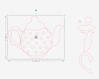
The teapot was selected from the Tea Time Dingbat font. I separated the pieces by releasing the compound path (right mouse click, and select Release Compound Path) and removed the pieces shown on the right. I then selected the whole exterior and the handle interior and made them into a new Compound path (right mouse click, and select Make Compound Path).
The round body of the teapot was enlarged slightly (select, hold down Shift on the keyboard, click and drag one of the white corner boxes) to match the exterior of the teapot. I doesn't matter if extends beyond the teapot outline slightly. The teapot outline was then moved away and the remaining circle and dots made into a compound path.
Both the resulting pieces were then turned to face the other way (select, Right mouse click, select Flip Horizontally). A heart was taken from the 'j' and enlarged to suit the size of the teapot. Once sizes were ascertained the teapot outline was cut from navy cardstock, the round body from mint adhesive cardstock and the heart from strawberry adhesive cardstock. See below for a hint on determining the sizes.
Teapot 'Steam'
The teapot steam was taken from the letter 'b', flipped, and resized to suit the teapot (to separate these pieces the path was released and then ungrouped). To make the acetate piece to support the steam, an offset was made of the group of steam pieces at 0.15 (Offset panel, change amount to 0.15, click Apply). Draw a rounded rectangle and weld it to the offset shape (select, Right mouse click, select Weld). The steam would be cut from grey adhesive cardstock, and the support from thin acetate. It was adhered behind the teapot spout and any protruding pieces trimmed away.
Teacup Topper
The teacup was made in a similar way to the teapot using the remainder of the pieces from the letter 'b'. I made the exterior shape and the handle interior into a compound path, then also made the saucer pieces a compound path with the cup exterior.
My cup exterior was cut from navy, the exterior minus the saucer pieces cut from mint, then the hearts from red, and the cup interior from grey. It is worth cutting out a few duplicates, some with pieces cut out and some entire, in different colour combinations and trying both the positive and the negative pieces.
Size and Placement of the Decorative Elements
Prior to cutting out the elements I found it really useful to cut them out in some scrap card first. It really helps to check where the elements will be going, and if the sizes are right relative to the card and to each other. Initially I had the cup over to the left of the pop up and the pot on the right, but realised that the pot looked so much better tipping into the cup.
To finish the card I adhered the teapot directly to the card, and the teacup was raised up on adhesive foam pads. I experimented with some extra hearts, but settled on just the ones on pot and cups.
I'm so pleased with how this turned out and urge you to experiment with your dingbat fonts. They open up so many possibilities.
Bye for now,
Crafting Quine Blog | @CraftingQuine
DESIGNS USED:
 |
 |
 |
PRODUCTS USED:
 |
 |


Beautifully made and put together, love everything about it.
ReplyDeleteFaith