Wednesday, 6 March 2019

Design Of The Week - Welcome Spring - 5th March 2019 - Making a Design Your Own.


Hello, hello - Karen here with my Wednesday post featuring the Design of the Week which is a pretty title 'Welcome Spring'.


As soon as I saw this design I knew that I wanted to make a wreath with the leaves.  I started by ungrouping the design and removing the leaf.


I then drew a circle and arranged the leaf ten times around the circle. 

I then gave them a 0.07 offset.


I also added a 0.07 offset to the title.


After cutting my pieces from patterned paper and adding to a piece of black cardstock I fussy cut some flowers, butterflies and feathers to finish my page. 


Monday, 4 March 2019

Back to basics: print bleed


Hello, it's Verity here from Pretty Little Button. For today's post, I'm going back to basics and showing you if you haven't used it already, how to use the print bleed feature in the most updated version of the software. Now you need to make sure your version of the software is 2.4  - if you don't have this, you can update here. There are a variety of different features in the new version, and it also depends on what edition of the studio you have - i.e basic, designer, designer plus, business etc. The print bleed feature should be available in the basic edition of the software. If you want to see a comparison of features in each edition of the software, head over here.

I have created three different cards with some fantastic designs from the Silhouette Store and used 3 different print bleed settings to show you the difference. The print bleed option is great if you are worried it might cut slightly misaligned. If this happens, you haven't got to worry around a white offset appearing when it shouldn't as the print bleed will print colour, further beyond the design. Therefore if it does cut misaligned, the colour of the image will still remain in that cut area and not appear white. This is a great feature if you want to cut lots of coloured die cuts and don't have many colours of cardstock. Instead, just use the print and cut feature combined with the print bleed like I have today and the possibilities are endless!

Using the 'Print bleed'  for die cut printed elements process: 


To start off,  add a selection of floral elements from the Store and colour the items in. To save time and a reduced amount of card wasted, use the nesting feature to nest all the design pieces up within the print and cut window (remember to turn this on using the registration marks tab within the page setup window on the right-hand tool bar). 


When nested, all items will be nested up near the top of the page within the print and cut area. 


However, you may wish to space the design elements out slightly for the 'print bleed' area. To do this, change the padding value within the nesting window. 


After pressing the 'Nest' button once more, the designs will have shift again proving slightly more space between the design elements.  To add the print bleed, you need to open up the Page Setup window. Down the bottom of the window, there is the option to select 'Print bleed'. Here you can adjust the amount of bleed - the default setting is 0.050 inch. 


For the florals above I used 0.020inc. When applying this, it does not alter the images within the studio - i.e it does not add the print bleed in the window for you to see. 

Following the print, you may not notice much difference for this print bleed as it is very small. 


 As you can see, once cut there is a print bleed, albeit thin in case of any misalignment.


For the dinosaur card, I used a print bleed setting of 0.030 inches. Once I had printed the dinosaurs, I made each group (i.e dinosaur, balloon etc) a compound path so it would only cut out the most out edge of the design. This was a layered design with many elements making of the dinosaur. However, as I printed rather than cut the individual layers, the design needed to be converted to a compound path to prevent cutting out each layer within the design. 


You can see the print bleed a little more with this setting once printed. The corners of the flags and balloons are not as sharp. 


This setting has given a reasonanbly good print bleed. 


For the unicorn card, I used a print bleed of 0.040inch. 


 It was much more obvious with this one, as some of the items are overlapping/slightly touching. Therefore this shows that if you are going to next your items, make sure you adjust the padding aree to reflect how much of a print bleed you are going to add.


 This setting gave ample room should any misalignment occur. 


On a side note, when you upload to the new version of the software, you get improved thumbnails of silhouette files. Prior, a Silhouette document would have the Solhouette logo for the thumbnail image, as seen below. 


Following the update, the thumbnails now include an image of what the file contains. This is great if your name of the file doesn't jog your memory as to what it is, the little image will do. Also makes it much faster to find the file you are after if you are able to see the contents of it in the thumbnail. 


Using the 'Print bleed'  for die cut printed elements photos:

To assemble the dinosaur card, I used ink blending brush to apply yellow ink to a background. Following this, I added splatters of the ink watered down for some added interest to the background.  The elements were foam mounted onto the card and some blue bakers twine added to the top of the card, to make the 'Party' banner. 


For the floral card, I ink blended through a striped stencil. You can see how this stencil was made on the Silhouette Cameo, in this post here.  The floral elements were foam mounted onto the card and the leaves were adhered using liquid adhesive. 


A layered die cut and heat embossed sentiment was added to the card, and it was finished off with a selection of sequins. 


For the unicorn card, pink ink was applied to the background with ink blending brushes and the items were layered onto the card with foam pads for added dimension along with a heat embossed sentiment.


For some added sparkle, glitter was added to the horn of the unicorn and the blue flower using a Wink of Stella brush. Laslty, the card was finished off with a selection of sequins. 


If this has inspired you to try this out, please post below. I would love to see it!

Until next time,

Verity


Profile Pretty Little Button Blog | Instagram | Facebook

DESIGNS USED:


PRODUCTS USED:


Sunday, 3 March 2019

Sunday's with Steph - 12 x 12 Scrapbooking layout - I love my dogs


Hello and welcome to this weeks blog post!

Anyone that knows me knows that I love my dogs, well dogs in general so when I found this cut file who better to scrapbook but my lovely hounds Rosie and Marvin https://www.silhouettedesignstore.com/designs?search=love+you+&sortby=relevance&submitted_search=true


So I cut it out on my tried and trusted white bazzill cardstock and then set to work!  I backed the big heart with a photo of my two doggo's sleeping and the other heart, the L and the V in pink hexagon paper and the E, Y and U in the heart paper.


I then chose some white dotted swiss cardstock which I trimmed down to 11 x 11 square.  I then used the love heart paper that I had previously gutted to create a border to take my layout back up to 12 x 12.

I placed the cutfile towards the left hand side of the page on some foam raisers and then used some coordinating floral stickers to decorate round the edges of the cutfile, along with some sequins and some puffy hearts.


I stuck some washi tape to the top left hand corner along with a perspective and a puffy heart and I added some more washi tape to the bottom right with the additional title and some more embellishments and sequins to complete the layout.

See you next week!

Take care,

Steph x x

Saturday, 2 March 2019

Hybrid Whiteboard Labels

Making Hybrid Whiteboard Labels for more decorative whiteboard labels and stickers - by Janet Packer https://craftingquine.blogspot.co.uk for the GraphtecGB Silhouette UK Blog


Hello, Janet here from the Crafting Quine blog. Today's post shows how to make hybrid wipeable whiteboard labels. I've combined the Silhouette Whiteboard Vinyl with other vinyls to give extra detail and decoration which could not be achieved by using the whiteboard vinyl alone. You get the best of both worlds - fancy labels with a wipeable panel which can be written on, erased, and re-written with a regular dry erase marker.

Making Hybrid Whiteboard Labels for more decorative whiteboard labels and stickers - by Janet Packer https://craftingquine.blogspot.co.uk for the GraphtecGB Silhouette UK Blog


I've chosen to add my labels to some clear paint pails which I'll admit have been sitting in my stash for way too long (they are still available to purchase at various online stores). The whiteboard vinyl has a semi-permanent adhesive backing and the product description says it can be used on many surfaces, both indoors and out, including walls, so the surface options are not limited to storage containers. I've combined it with both regular adhesive vinyl for this project, and with premium translucent vinyl too, in order to show you just how versatile this product is.


Selecting the Design
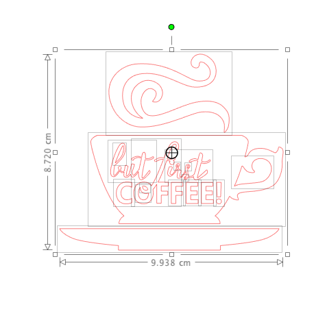
I'd recommend choosing a design whose outline is not too intricate. The whiteboard vinyl is thicker than regular sign vinyl, and cuts well, but I don't think lacy or delicate outlines would be easy to work with. I chose a coffee cup design (#175243) for my coffee bean storage pails, there are many other alternatives in the Silhouette Design Store.

Making Hybrid Whiteboard Labels for more decorative whiteboard labels and stickers - by Janet Packer https://craftingquine.blogspot.co.uk for the GraphtecGB Silhouette UK Blog


Coffee Bean Pails
I store my coffee beans in a sealable container, but often get the different beans confused. These labels should end that confusion and hopefully I'll no longer end up with an unexpected cup of decaf. Almost any coffee cup design could be used. The one I used originally had writing on the cup.


Simplify the Design
To remove the writing open the design in the Silhouette Studio software, ungroup the elements, remove the letters, and regroup the remainder. With some designs it might be necessary to release the compound path, delete and remake (or a combination of ungrouping and removing path). You'll see when you've isolated the elements you need when they have a light grey box around them when the design is selected.
Making Hybrid Whiteboard Labels for more decorative whiteboard labels and stickers - by Janet Packer https://craftingquine.blogspot.co.uk for the GraphtecGB Silhouette UK Blog

Add an Outline
Make an outline of the whole cup using an External Offset.

Making Hybrid Whiteboard Labels for more decorative whiteboard labels and stickers - by Janet Packer https://craftingquine.blogspot.co.uk for the GraphtecGB Silhouette UK Blog


Simplify the Outline by deleting any tiny pieces.

Making Hybrid Whiteboard Labels for more decorative whiteboard labels and stickers - by Janet Packer https://craftingquine.blogspot.co.uk for the GraphtecGB Silhouette UK Blog


Make a Panel for Writing
Use internal offset to make a writing panel on the cup. This panel could be placed on top of the cup, but I chose to delete the shape from the cup. An internal offset gives an unwanted part to the shape near the handle. Remove this using Point editing.

Making Hybrid Whiteboard Labels for more decorative whiteboard labels and stickers - by Janet Packer https://craftingquine.blogspot.co.uk for the GraphtecGB Silhouette UK Blog

Here are the shapes ready to cut; the one the left from whiteboard vinyl, and the one on the right from brown glossy vinyl.
Making Hybrid Whiteboard Labels for more decorative whiteboard labels and stickers - by Janet Packer https://craftingquine.blogspot.co.uk for the GraphtecGB Silhouette UK Blog

Cut both vinyl pieces and weed (remove any unwanted parts). There is a cut setting for the whiteboard vinyl in later versions of the software, use a test cut and adjust/reduce to where the whiteboard still cuts through.


Apply the Vinyl
First pick up the brown vinyl onto transfer tape, then align it over the whiteboard vinyl.

Making Hybrid Whiteboard Labels for more decorative whiteboard labels and stickers - by Janet Packer https://craftingquine.blogspot.co.uk for the GraphtecGB Silhouette UK Blog

Lift up both layers on the transfer tape and apply them to the pail or other surface. Burnish it well and carefully peel off the transfer tape leaving the vinyl layers behind.

Making Hybrid Whiteboard Labels for more decorative whiteboard labels and stickers - by Janet Packer https://craftingquine.blogspot.co.uk for the GraphtecGB Silhouette UK Blog


The same technique could be applied to other designs. Here is a bunny label made in a similar way with Silhouette Translucent Vinyl instead of the glossy vinyl.

Making Hybrid Whiteboard Labels for more decorative whiteboard labels and stickers - by Janet Packer https://craftingquine.blogspot.co.uk for the GraphtecGB Silhouette UK Blog


Here the waste translucent vinyl has been used too.

Making Hybrid Whiteboard Labels for more decorative whiteboard labels and stickers - by Janet Packer https://craftingquine.blogspot.co.uk for the GraphtecGB Silhouette UK Blog


I hope this post has inspired you to make your own hybrid labels using the whiteboard vinyl and that you'll try it.


Bye for now,

  Crafting Quine Blog@CraftingQuine


DESIGNS USED:
But First Coffee by Sarah Bailey Easter Bunny w/heart by Loni Stevens


PRODUCTS USED:
 Silhouette Whiteboard Vinyl  Silhouette Glossy Permanent  Vinyl