Monday, 9 May 2016

Embroidery Thread and Chipboard Letters

Embroidery Thread and Chipboard Letters

Hiiii

Caroline here with a fun tutorial!

We'll be making these letters and incorporating them in to some home decor.


 What you will need:

  • Silhouette chipboard
  • Silhouette cameo/portrait
  •  Embroidery Floss
  • Cellotape
  • Wet Glue
  • Hot Glue Gun
  • Box Frame
  • Patterned Paper
  • Ephemera/Embellishments
  • A peg (optional)

How to make the letters:

Now for quite a lot of you this will seem quite a basic use of the silhouette but this blog is for all skill levels I think it's important to include it!

First of all you will need to create your text in the silhouette software. To do this click the text button on the left...


Then on the cutting are begin to type your letters. Once you have typed them you can double click the text and highlight it and a panel will appear on the right. Use this to edit the style and the size of the text...


As I knew I wanted my letters to be wrapped in the embroidery floss I made them large enough to do this as it can be a bit fiddly, yet not too big to fit in my box frame.

The silhouette chipboard is fantastic as it cuts like butter but I wanted mine to be super sturdy so I needed to make quite a few layers of the letters. They needed to be the exact same size as each other so I highlighted the text and then went to the edit button where I clicked copy...


Then I pasted the letters 6 times...


The next step was to run them through my silhouette cameo on the following setting...


Here are the cut out letters:


Now we want to make them very strong so each of the letters need to be glued together...


Now for the fun part, grab some embroidery floss and start by attaching it to the letter using cellotape then wind around as neatly as possible, you will see that I always keep mine going in one direction no matter what the shape of the letter is and when you reach the end use more tape to secure the thread...


You can obviously use any colours you want, I chose these to match in with the papers I wanted to use. You could also change the colour of the thread part way through the letter and create a pretty ombre effect, or stripes.


I've chosen to use my letters in a shadow box but you could create a large letter and hang it on the wall, or use them on a scrapbook page.


The next stage for me was to decorate the box...


The simplest way was to lay the frame down on some thick card and draw around the shapes inside and outside of the frame sections and then i could measure what size these boxes were and cut the paper to the right size and stick it directly on to the piece of card, it was very easy.

Now have fun choosing embellishments and memorabilia to match. I wrote little notes and wishes for Lily and made a little wish jar with glitter.


 I wanted to have the option for her to change the photo whenever she wanted or as she grew, so I used a glittered peg which I hot glued in place.


Then I again used hot glue to stick the letters in place and make them very secure.  I LOVE how they look HA!

Finally here is the whole boxed image again...


I hope you like it and that you have a go, it's such a fun and individual project that you can put your own spin on!


Thanks for taking the time to read this and I'll see you again soon with another project

C x

Blog
Pinterest
Instagram
Facebook

Products Used:

PRODUCTS USED:


Light hold cutting mat for Cameo


Sunday, 8 May 2016

New Baby Card - Inspired by a Scrapbook Page


I was brousing through the Silhouette Design Store for inspiration as a friend had recently had a baby girl and I needed to make a card.  As soon as I saw the cute baby shoe I knew I had found the perfect shape to use and then remembered I had made a layout about the first time Gracia had put two words together which happened to be 'New Thews'.  At the time she was delighted with her new shoes and I have to say over 20 years later she is still just as thrilled whenever she gets a new pair!


I wanted to translate as much of the 'girlieness' from the layout to the card and so decided to add lots of paper flowers and pearls.


STEP 1 - Making your shoes.

  • As I was going  to use a five inch square card as my base I opened the cutting file and using the Scale option - resized it to 60% of the original size. 

  • I then used Ctrl+Shift G to ungroup the pieces and deleted the double sole and button part of the design. 
  • Next I moved the pieces around so that all the pieces I wanted to cut in the spotty paper were in one place, dragged a box around them all and chose 'Mirror Right' from the Replicate Menu to give me the components for both a left and right shoe. I did the same with the sole of the shoe. 

I used the font 'Moonshine For Lucy' to write Baby Girl and added my flourishes, which I resized to 3 ins and mirrored as above I then moved these and the soles of the shoes to the bottom right of the page.  I was able to cut both the brown and spotty paper at the same time by placing my spot paper at the top and my brown paper at the bottom. 


STEP 2 - Cutting the flowers.

  • I chose the flower shapes I wanted, resized  and arranged them onto my drawing area.  I cut out more than I needed to give myself lots of scope for how I arranged them on my card.  

  • These flowers are really cute as the petals fold up to give them a 3D effect.

STEP 3 - Assembling your card.

  • I covered the front of my card with some pink paper. Glue the top of the shoes to the sole and added the strap and finally make the bows to go on the front.  I added these to my card, slightly overlapping the left shoe over the right.  
  • In the top right corner I added my sentiment and in the top left added a couple of small flourishes and flowers.
  • I then 'went to town' on the florishes and flowers at the bottom. My final job was to add some pearls to the centres of the flowers.
I think you will agree that this is a lovely card for a beautiful baby girl.


DESIGNS USED:


PRODUCTS USED:


Saturday, 7 May 2016

How to Design Typography Papercuts


Hello, Nadine here today with a guide to designing papercuts that incorporate wording. I am addicted to beautiful fonts and in this tutorial I'll give you the lowdown on how to use different typefaces within a papercut design. In the picture above, I have used a number of different fonts and techniques and we will cover them all in this tutorial.  I have also selected some of my previous projects and just a few of the many beautiful designs available from the Silhouette Design Store to illustrate techniques.

Next week, I'll be back with a step-by-step tutorial on how to make the following papercut which I designed as a wedding present for my close friends' Emily and Callum.  I will also include a free Silhouette compatible cut file with the heart frame to help get you started.


General Tips

My first tip is to use ascenders and descenders to join your words.  Ascenders are the parts of a letter which extend above the normal height of lowercase letters.  Similarly, descenders extend below the baseline. 

In my example, notice how I have joined the 'P' and 't' ascenders from the word 'Papercut' to the line above and lower case 'p' descender to the word below.


Use connectors, such as a skinny rectangle to join diacritics.  Diacritics are the dots in the letters 'i' and 'j' or accents over vowels.

The following design #40914 by Jamie Koay illustrates both the idea of joining words with ascenders and descenders and connectors on dots.

https://www.silhouettedesignstore.com/view-shape/40914


Script Fonts and the Weld Tool

Script fonts mimic 'joined-up' cursive handwriting and can vary from formal calligraphy to more casual, looser writing.

Script fonts are naturally very well suited to papercuts as they form continuous shapes within each word with minimal effort, all you need to do, is use the Weld tool which is the most important tool of all when making papercuts. 


See how the Weld tool merged the letters from the word 'With' together?  Without this, the Silhouette would cut out all lines, even the overlaps and you'd end up with lots of loose letters.

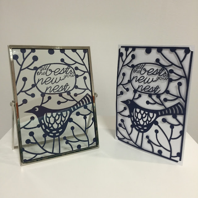
I used the font called Lovely Script by Gina Marshall in conjunction with Nic Squirrell's Bird Design to create the message 'All the best in your new nest' in the papercut below:


Here is another design in which I used the Edwardian Script ITC which comes free with Microsoft Office to make a papercut for my fabulous granny Dilys:


Serif fonts and Character Spacing


A serif is a flare or terminating flourish on a letter.  The most famous serif font is probably Times New Roman.  Sans serif fonts in contrast do not have the decorative lines and flourishes, for example Arial.

Serif fonts are popular for papercuts when using an approach in which each letter is made to touch the next.  The reason why these fonts work better than sans serif fonts is because these lines and bars provide good joining points, whilst still allowing each letter to 'breathe' and have definition.  See in the example below how the word 'definition' in serif font remains readable, whereas the sans serif font becomes very difficult.

To make each letter touch the next, simply reduce the Character Spacing within the Text window.  If you want to sound fancy, character spacing is officially known as kerning.

In my recent tutorial which showed how to apply vinyl to glass, I used a serif font for my text and made each letter touch the next.

Here is a tag I made for the papercut wedding gift. I used a closely kerned serif font combined with some connecting bars.


Uppercase and Support Bars

A simple way to create a papercut is by writing your text in uppercase and weld a long slim rectangular bar at the top and bottom of the lettering.  Serif fonts can be used, but often cleaner fonts allow the letters to be seen more clearly.  I used this approach for the word 'DESIGN' in my example papercut.

Here is an example by Jennifer Wambach #37206. 
http://www.silhouettedesignstore.com/view-shape/37206

Stencil Fonts and Negative Space

Until now, all of our designs have the letters in paper and the spaces around cut away.  It's possible to reverse this and have the letters cut out instead.  If you would like to keep the floating shapes such as the holes in 'o' 'e' and 'a' (fancy-pants typography name is counters) then use a stencil font.


Here is an example from Ty Pilcher #44369
https://www.silhouettedesignstore.com/view-shape/44369

It's quite trendy now to have a casual, hand cut look in which the inside shapes are missing.  For example this design from Emily Dyer
https://www.silhouettedesignstore.com/view-shape/53740


Sans Serif Fonts and Bunting Strings

Finally, we have the approach that I'll be covering in detail next week - hanging text from strings in the style of bunting.


Here is an example from a similar project that I completed recently.


I hope that you have found this guide useful and are inspired to experiment with different approaches.  Do you have a favourite technique or have any extra hints?  If so, I'd love to hear from you in the comments below.  See you next week for part two!